Lark Sheet

Lark Sheet is ByteDance’s collaborative spreadsheet product. I spearheaded the improvement of the conditional formatting feature, which was a major outstanding problem as per user feedback.

SKILLS
UX/UI Design
Competitor Analysis
User Interview
Usability Testing
Documentation
TEAM
Tsahao Yu, UX Designer (Me)
Qian Jiang, Product Manager
Zhe Zhang, Software Engineer
TIME

May - Aug 2021

Launched in Sep 2021

Background
Lark Sheet is a speadsheet product of Lark Suite collaboration platform

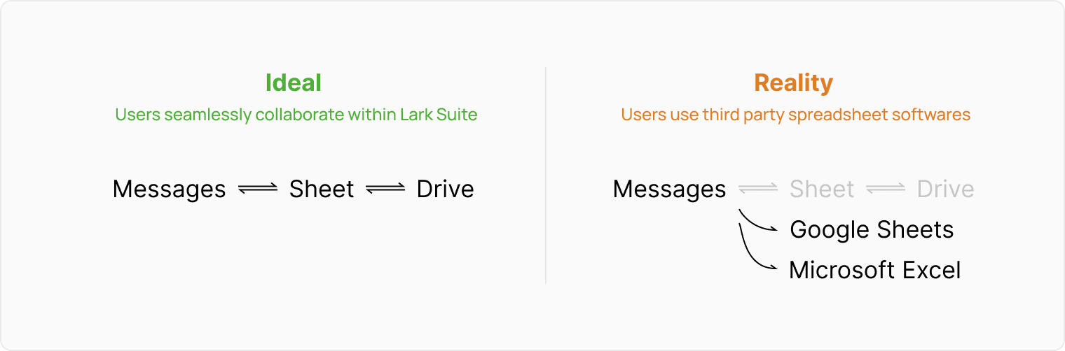
As an all-in-one collaboration suite, Lark aims to minimize the friction between different tasks, enabling better productivity. Some core functions include email, instant messaging, collaborative document, and cloud storage. I was working under Lark Sheet segment, iterating on this online collaborative spreadsheet.

the problem
The lacking in conditional formatting leads to loss of customers
Conditional formatting is a feature to change the format of cells based on the rules you set. A special format on certain cells can provide visual cues to assist conveying information. Because of time constraint, when Lark Sheet first launched, it only supported the very basic “Single Color” rule of conditional formatting. Adding more conditional formatting styles was the top 1 request from users.
Conditional Formatting of Lark Sheet was limited compared to competitors
As a result, only 27% of Lark users who needed conditonal formatting can successfully set it on Lark Sheet. This means that the majority had to switch to competitors, breaking the seamless collaboration experience.
Lark Sheet was losing customers because of a limited Conditional Formatting support
problem statement
How might we improve conditional formatting to increase user retention?
PM defined following metrics as desired outcomes:
(1) Improve the usage of conditional formatting by 35%
(2) Increase success rate of setting a desired conditional format by 40%

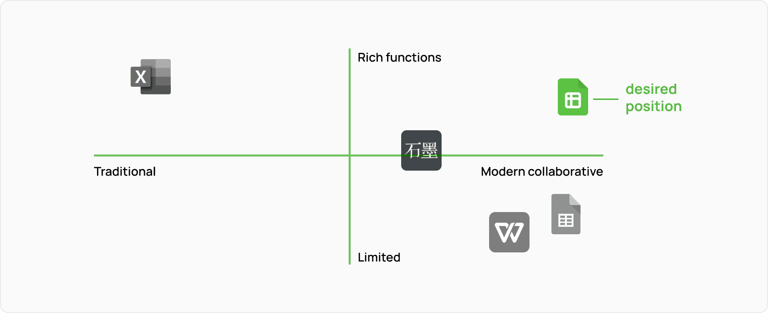
Making Lark Sheet more capable, potentially more users would switch to Lark Sheet from competitors. This can also attract new users to adopt Lark Suite.
user stories
What are the use cases of conditional formatting?
To understand what each conditional formatting style helps users accomplish, I read the feedback that users sent to our customer support team, and then distilled user feedback to compose three user stories to have an empathetic understanding of the use cases:

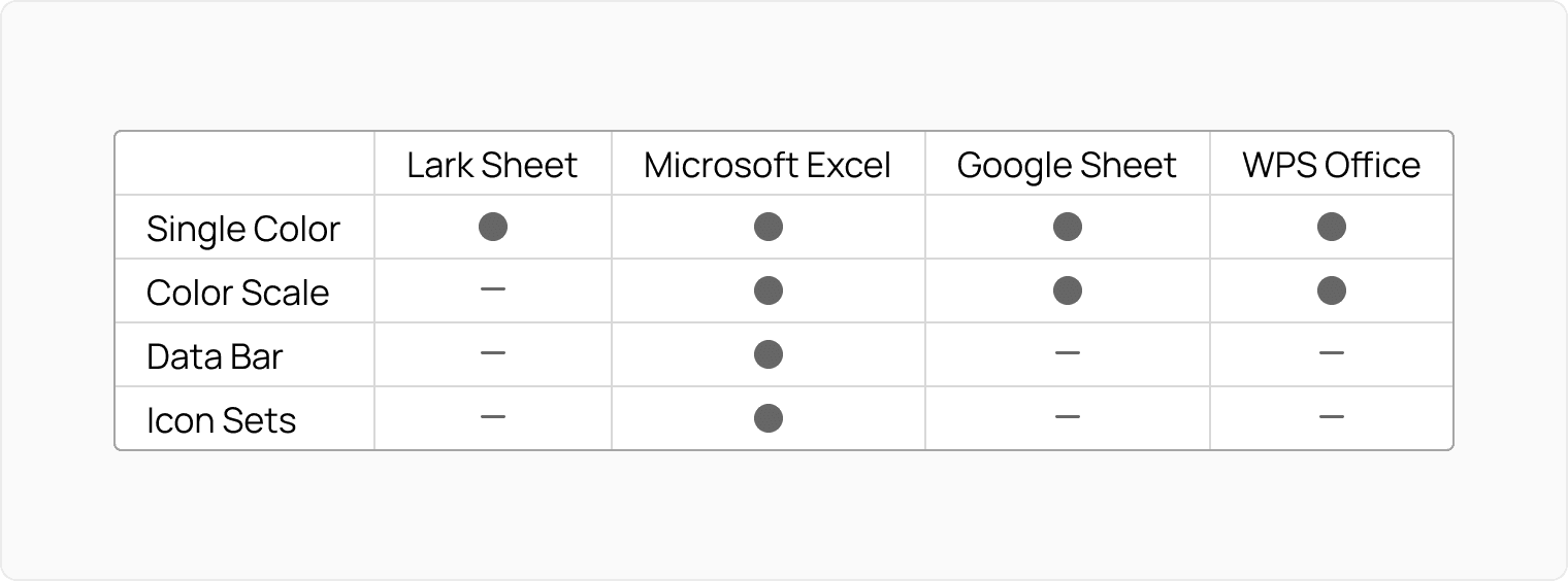
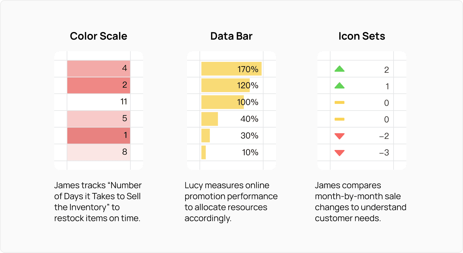
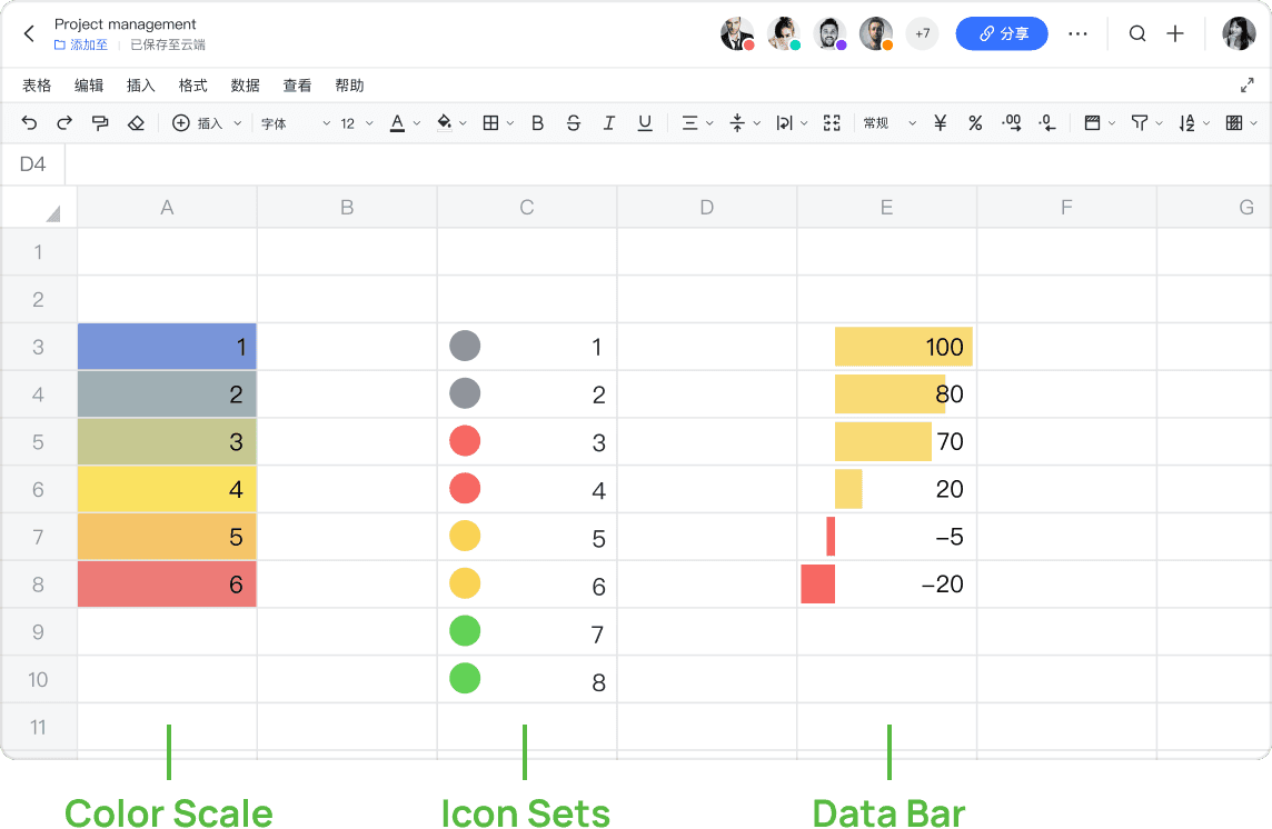
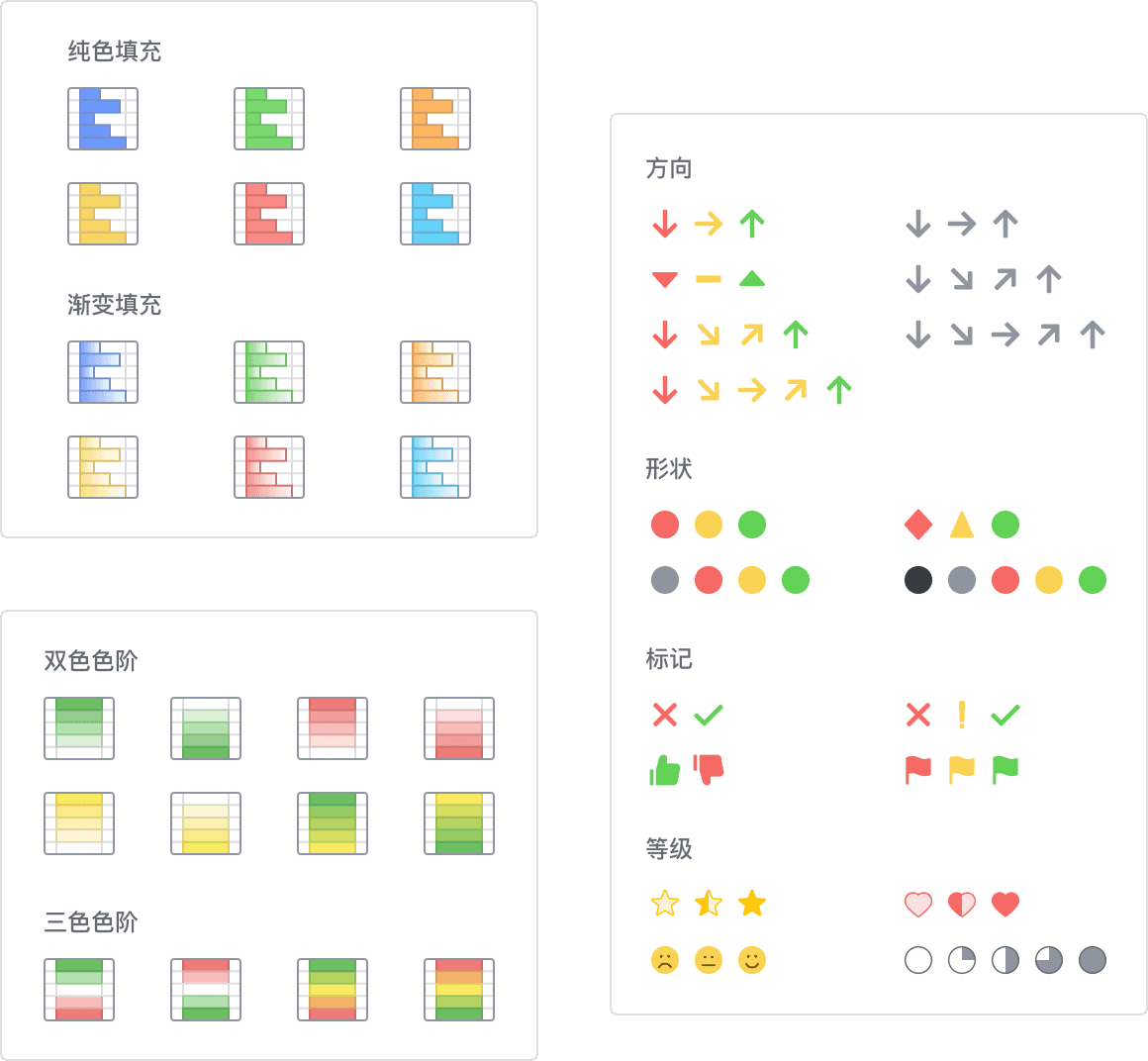
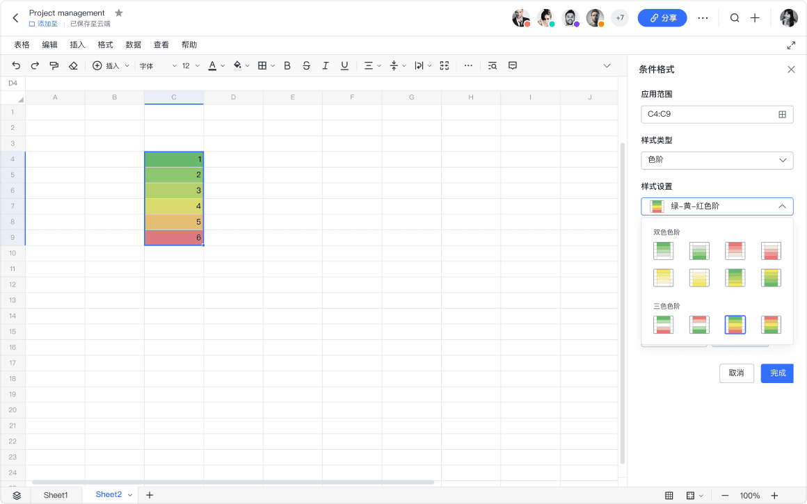
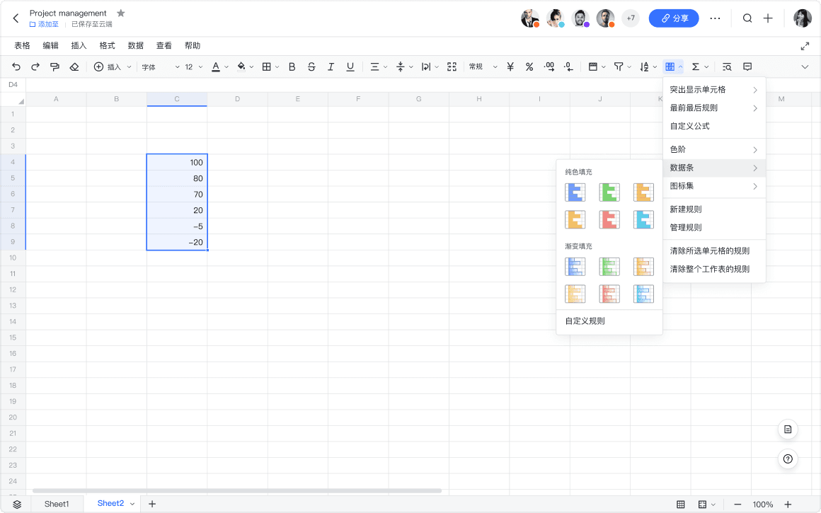
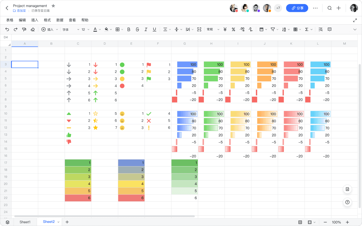
Color scale, data bar, and icon sets respectively help make information like at-risk items, progress, and changes glanceable.
User stories of three styles of Conditional Formatting
competitor analysis
Discover space for improvements
I conducted a competitor analysis among major spreadsheet products and our Chinese competitors to understand how other tools approach conditional formatting and find space for improvement.
Products that I conducted competitive analysis with
user interviews
Evaluate hypothesis from competitive analysis
I conducted unstructured interviews through messaging and audio chat with 9 users who provided feedback on conditonal formatting before to evaluate the hypothesis I came up in the last step, and further discover their pain points using competitors.
Findings
Strike a balance between functionality and usability
1. Modern collaborative products tend to have limited functions
Online collaborative products exclude some rules to simplify the interaction, for example, Icon Sets are not included by most collaborative spreadsheet products.

After talking to participants, however, I found that 1/3 of participants need Icon Sets. Therefore, I decided to include all three Conditional Formatting rules.
2. Traditional products come with unintuitive interfaces and inefficient interactions.
The interviews confirmed my assumptions that the customization options in the panels are unintuitive. There are some options in the panel that they don’t understand and never use.
Complicated UI of Microsoft Excel
The use of modal panel blocks the spreadsheet area, so that users have to apply a setting to see the effects, and enter again to adjust.
Users have to repeatedly enter the panel to adjust style settings
Design goal is to strike a balance between functionality and usability.
Smoother user experience shouldn’t come at a cost of limited features. I decided to add all three new conditional formatting styles, Color Scale, Data Bar, and Icon Sets, and optimize the process to remove unnecessary information and steps.
Desired positioning of Lark Sheet’s conditional formatting
Design
Added 3 new Conditional Formatting styles, while maintaining a consistent panel layout
After adding Color Scales, Data Bar, and Icon Sets, Lark Sheet becomes the collaborative spreadsheet with the most capable conditional formatting features.
I maintained the same structure across three styles, where rule settings are on the top and style settings are at the bottom. Together with clear titles, it minizes information load.
Panel structure across Color Scale, Data Bar, Icon Sets
Real-time preview to help users find a satisfied effect within one flow
Responding to the pain point that users cannot preview the effects while adjusting, I chose to use side panel instead of modal window to host the conditional formatting settings. Therefore the panel doesn’t block the spreadsheet area while editing and users don’t need to go back and forth to test the effects.

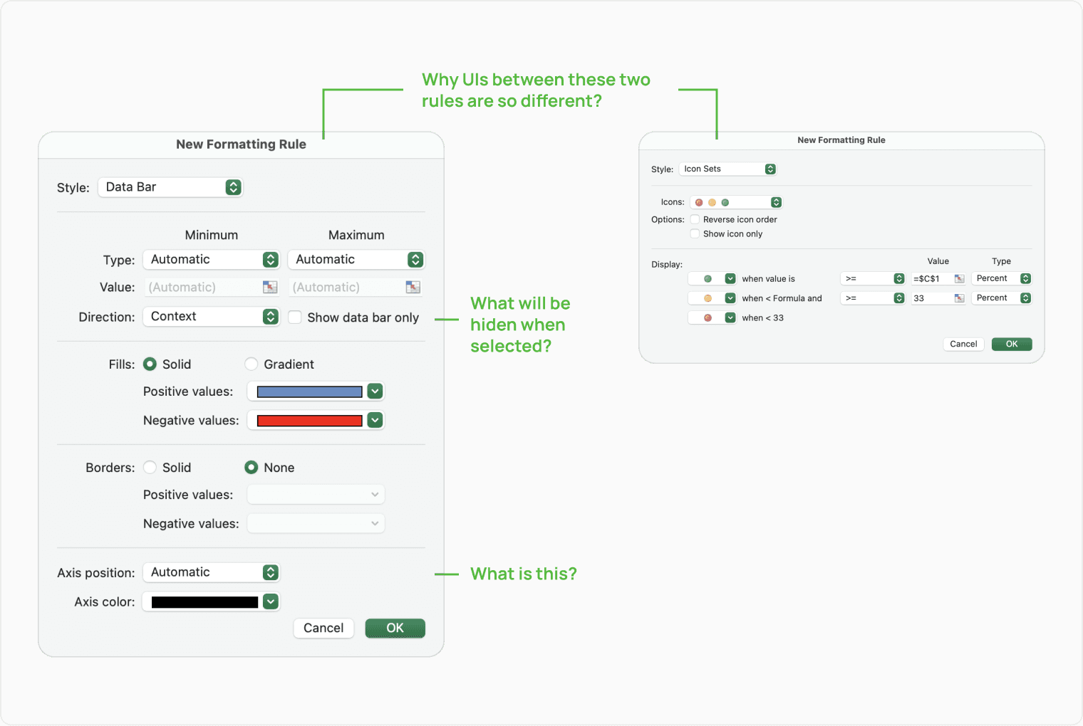
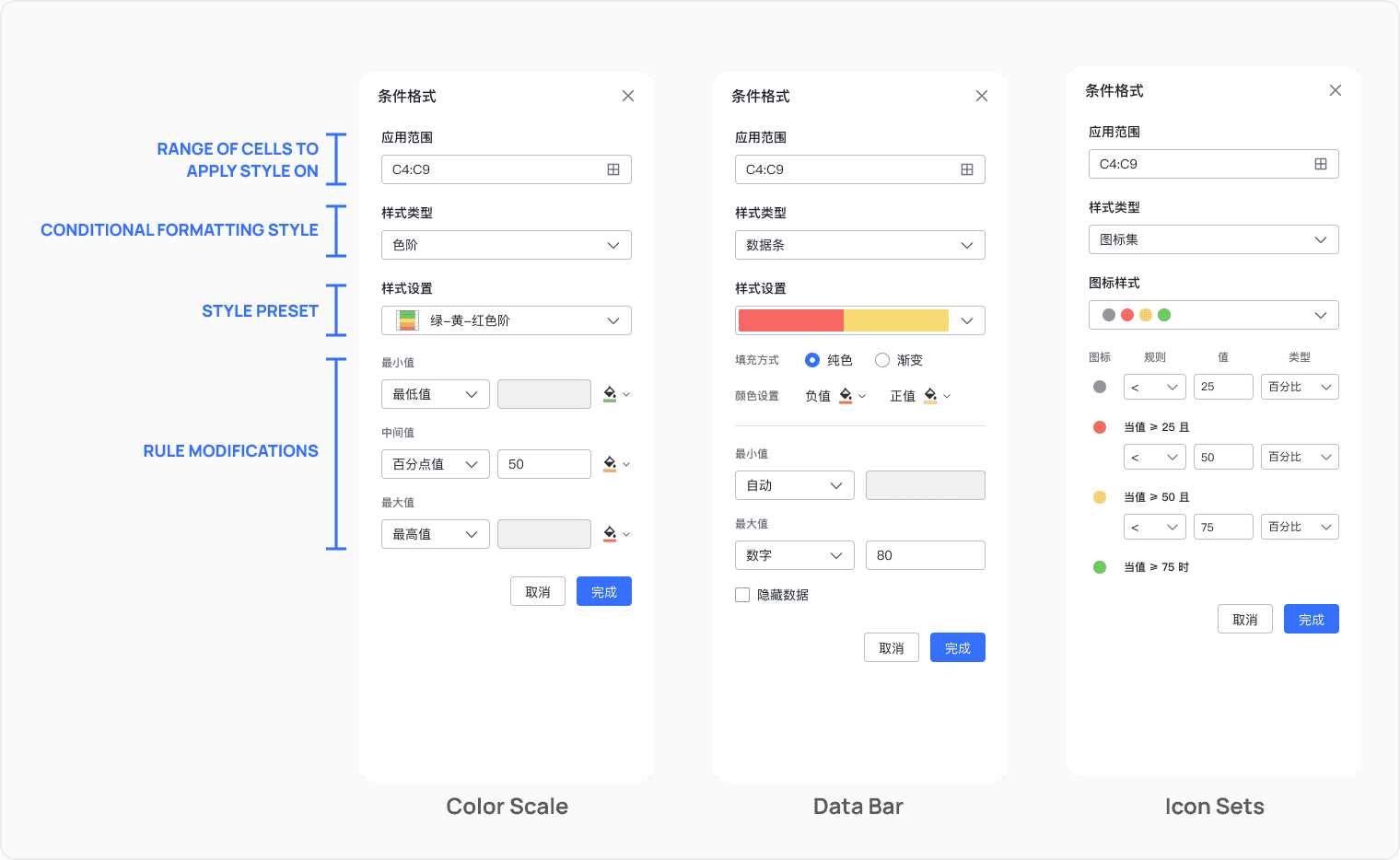
Users can preview the effects in real-time while setting conditional formatting

Color Scale adjustments that matched with users’ mental model
Most spreadsheet products define 2-color scales and 3-color scales two different conditional formatting styles, which means users have to switch to another style to add or remove a midpoint color, as the following figure shows.
Most competitors like Microsoft Excel seperate 2-Color and 3-Color Scale to two modes
I realized that this interaction doesn’t match with users’ mental flow as these two are not two different styles, but just a “Color Scale” style with 2 or 3 color settings.

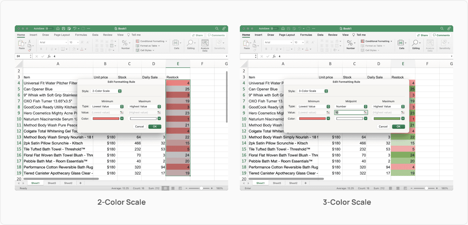
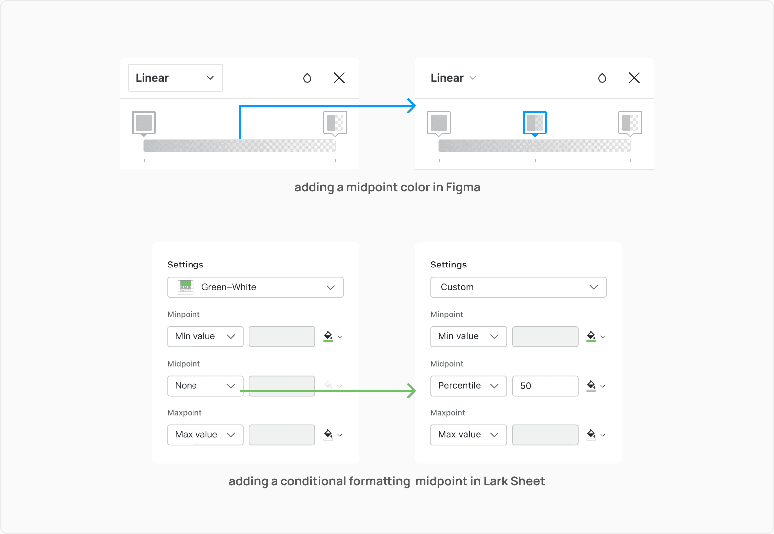
This is very similar to the Linear color tool in design software. I borrowed that interaction and reapproached the Color Scale settings, so that 2-color scale is just a color scale but with midpoint set to “none”.

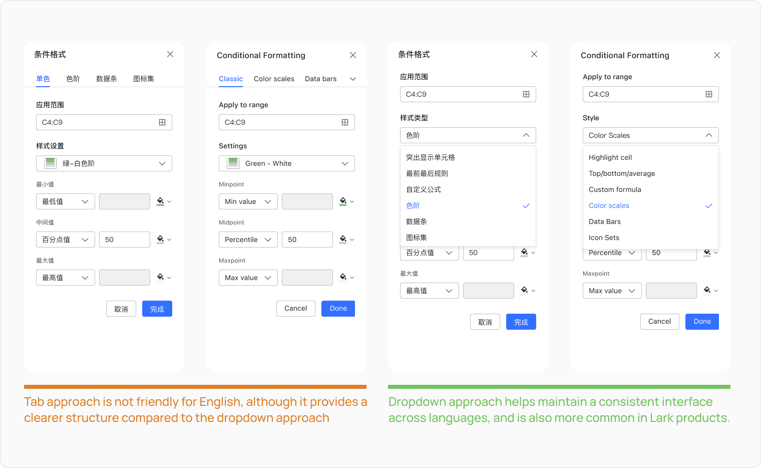
Design for localization

There were two approaches that I was considering for switching conditional formatting styles, tab or dropdown menu. Tab gives a clearer view of all options it affords in Chinese. However, in English version, tab items will collapse as a result of a bigger item width. I decided to go with the dropdown approach for consistency.
Tab Approach V.S. Dropdown Approach for Style Selection
visual design
Vibrant, Identifiable, Accessible

The icons of Data Bars and Color Scales are miniature spreadsheet cells, which gives users an expectation of the effect on the spreadsheet if applied.


I also carefully considered colors used. Based on the hue from Lark design system, I decreased the lightness and adjusted the saturation to ensure a good contrast between the background color and the text on top of it.

result & Reflection
After the new feature shipped, the user engagement rate increased by 60%, meeting the metrics set by product manager. User feedback also shows their preference of conditional formatting of our product over alternative products.

Initially my hypothesis and design goals were challenged by PM. I realized when designing corporate products, it is crucial to make research-backed deicisions to ensure we align with customer values.

When negotiating with other roles, designers should wear other people’s shoes. For example, I pursuaded the engineer to accept my design by reasoning that it would actually benefit them when the next feature was in development.

Previous to Lark Sheet, I have only worked on products of which myself was a user, where I can trust my gut feelings sometimes, as they come from my understanding of the product after prolonged use. However, when designing for products that designers are not personally familiar with, evaluating hypothesis and testing design is very crutial to avoid misalignments with user needs.

No data collection

Last Updated - Jul 25, 2022