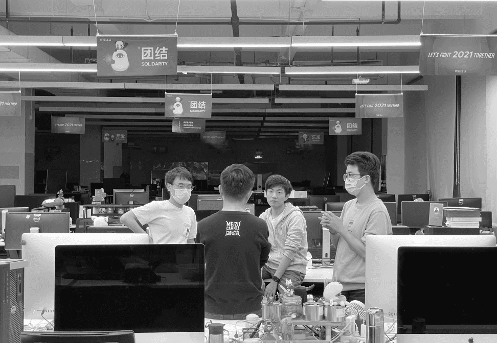
My work at MEIZU includes spearheading a new smart home app, delivering feature updates, and establishing high-level sound design principles. I worked cross-functionally, designing, prototyping, and writing, to ship delightful experiences.
Interaction Design
Prototyping
Design Review
Design Guidelines
Website Design
Presentation Copywriting
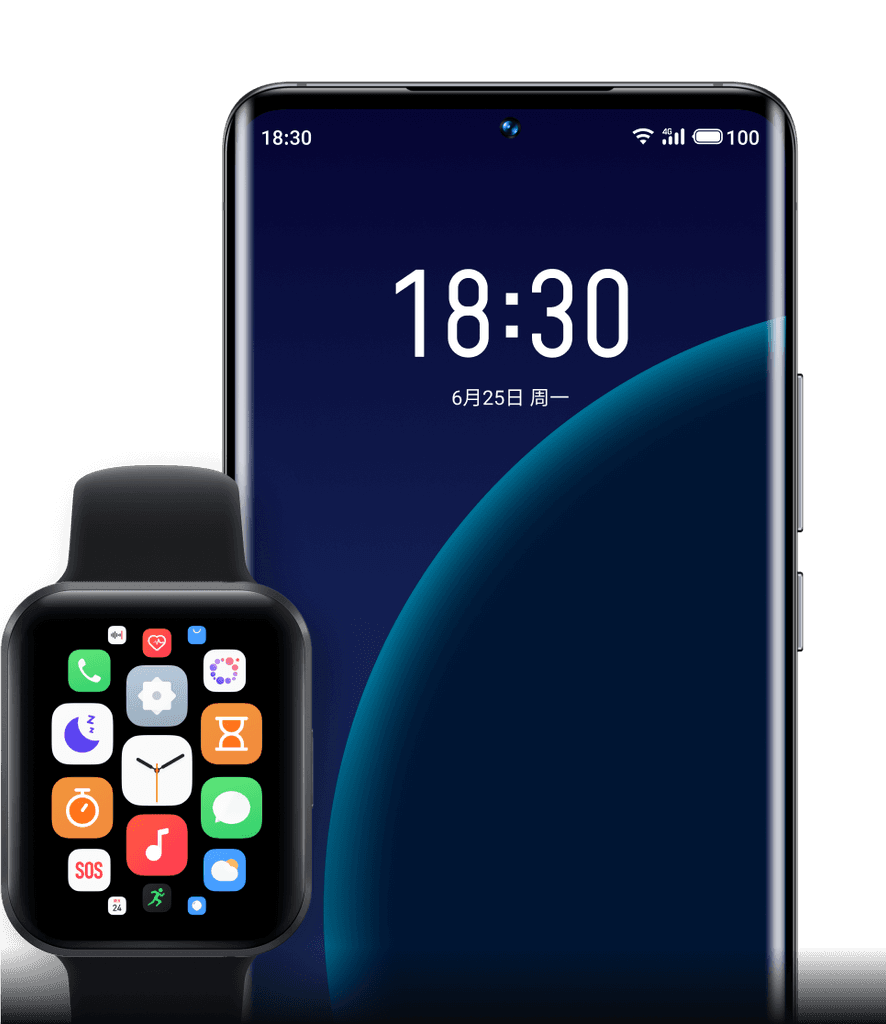
TABLE OF CONTENTS




TEAM
1 motion designer, 1 product manager, 1 Android developer, 1 iOS developer
TIMELINE
3 months, 2019
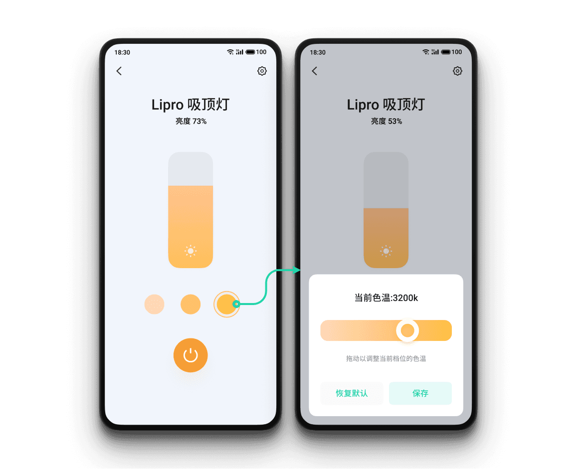
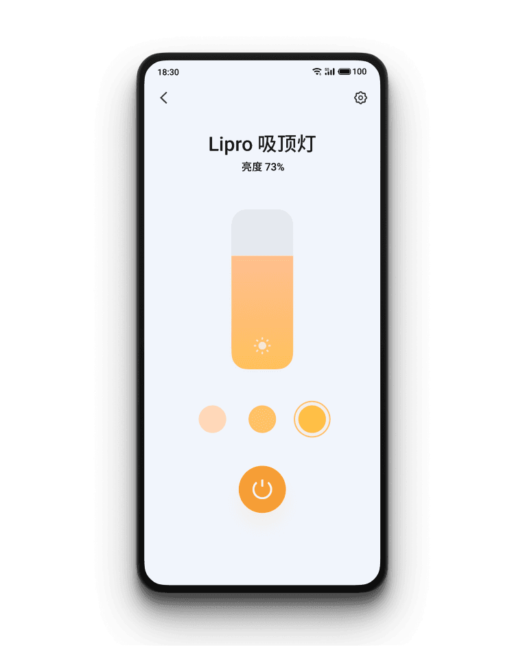
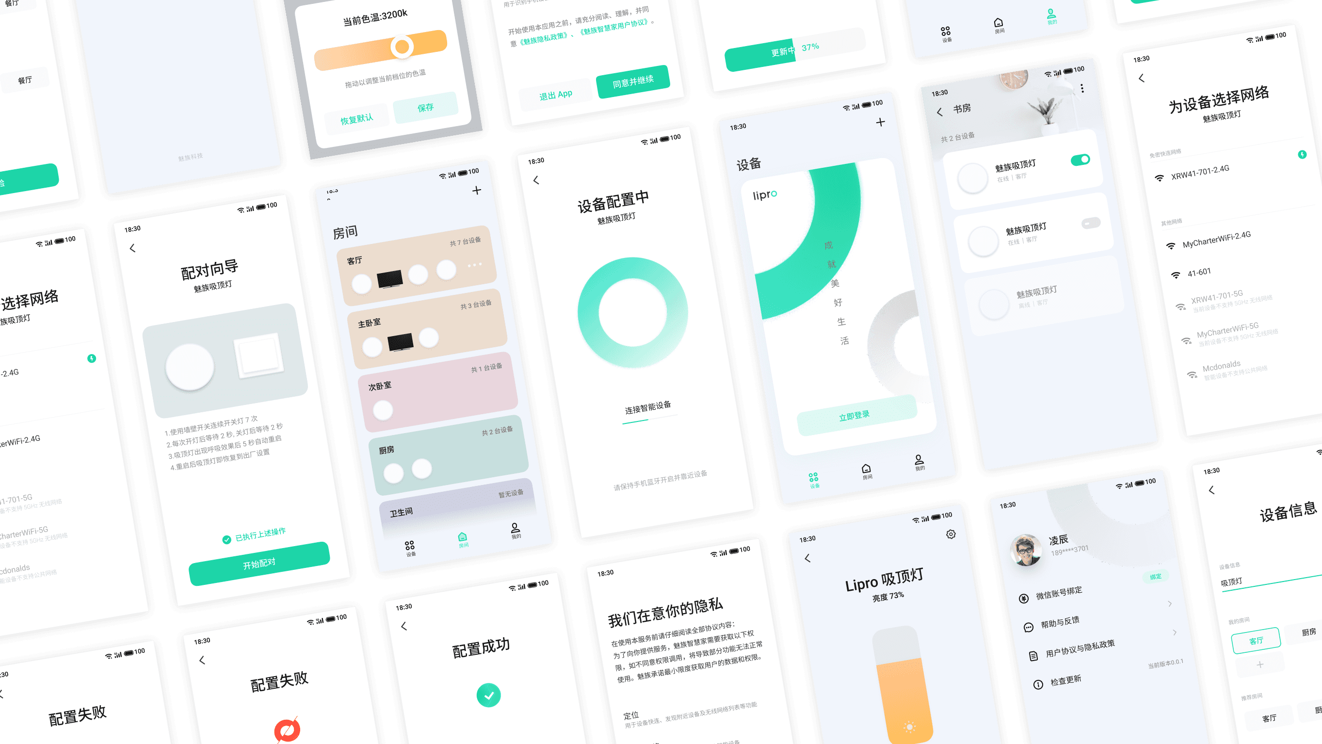
The color temperature of the light has a small range of 3000-4000K, so that gradual adjusting won’t generate a noticeable effect.
To mitigate this, I only gave three temp options on the outside. If users want to set the light temp to a specific value, they must tap again to open a popup. This minor inconvenience was intentionally created to avoid gradual color temp adjustment.
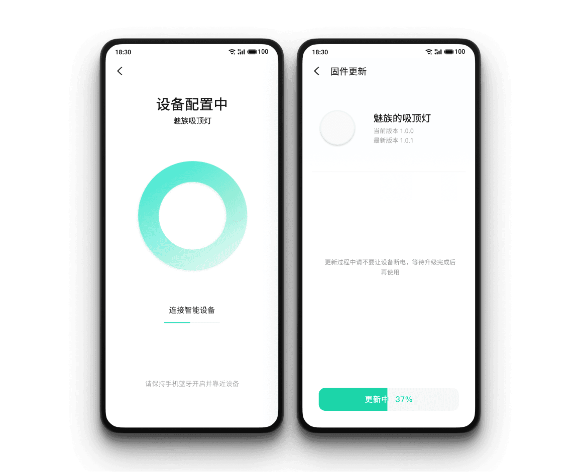
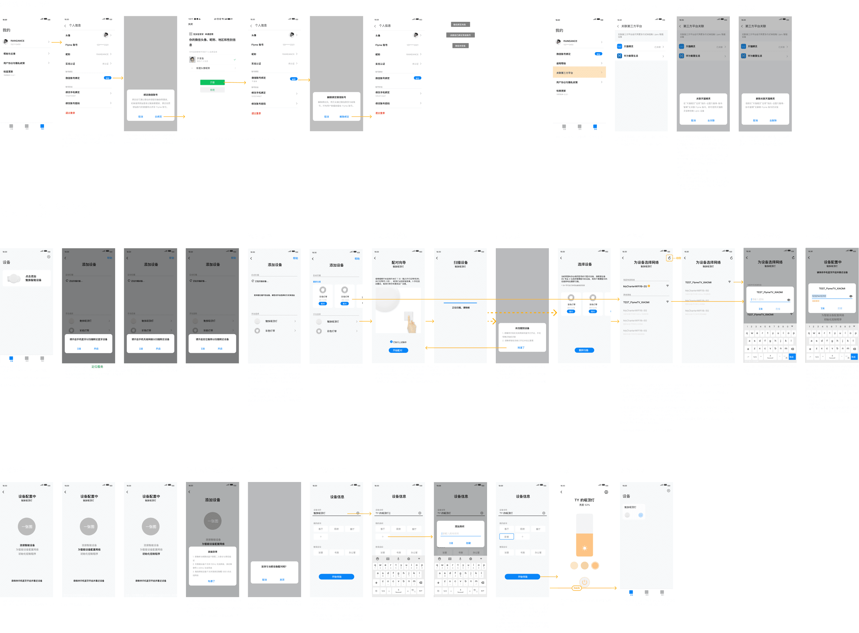
Sometimes a pairing or firmware update could take quite a while. I provided clarity through progress bar, animation, and writing to make users feel in control.
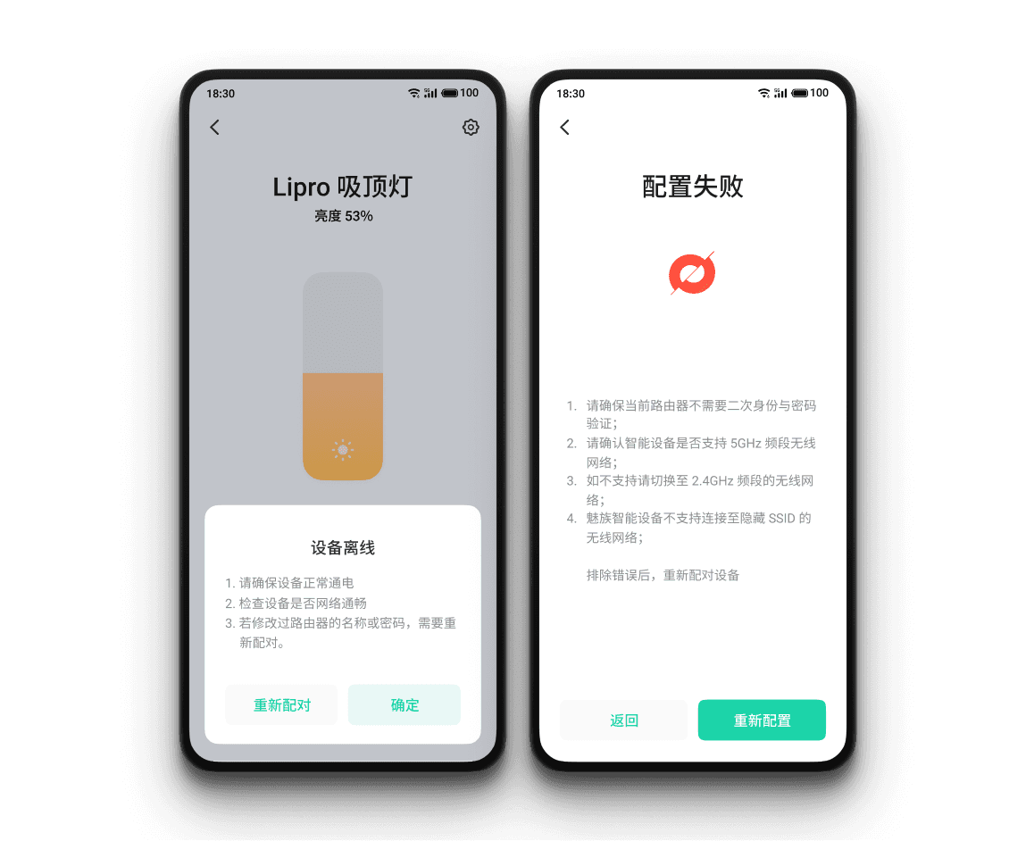
Working with hardware, it is inevitable that sometimes it just stops working. I gave specific troubleshoot instructions so users know what actions to take instead of freaking out. Users can tap on “try again” from the error page to give another attempt quickly.
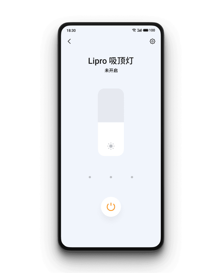
Light control interface is versatile to show all possible statuses of the device.
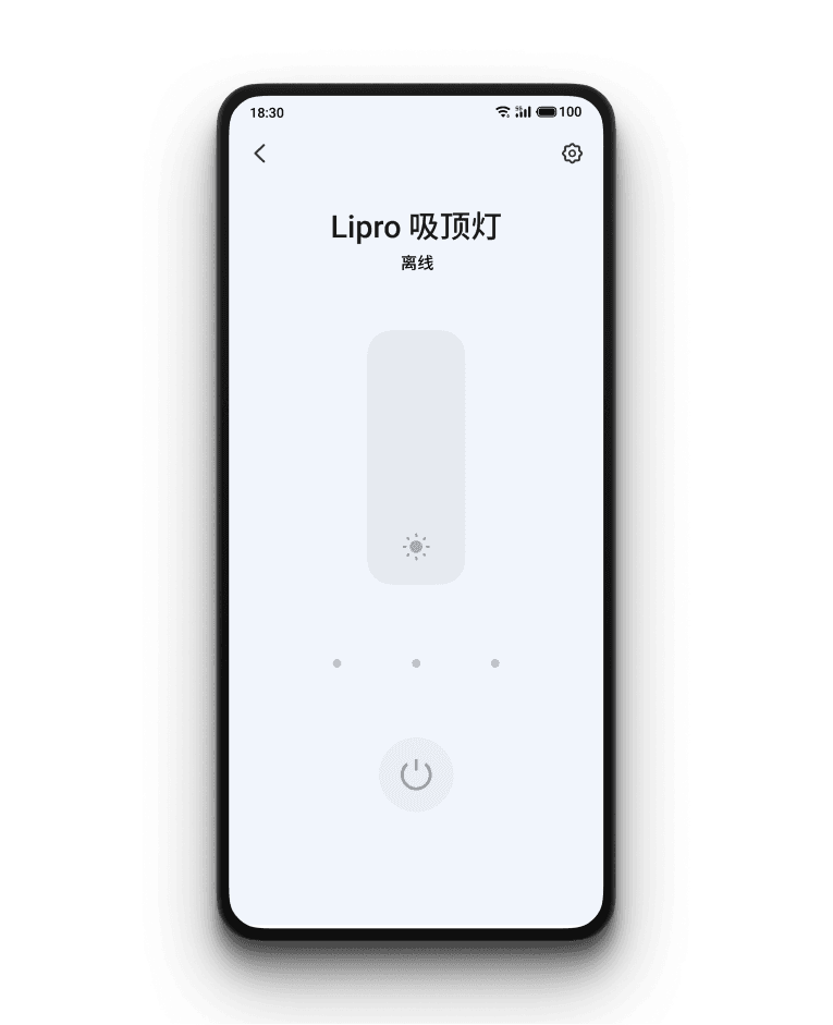
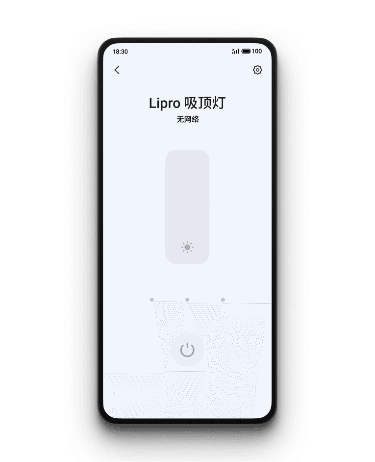
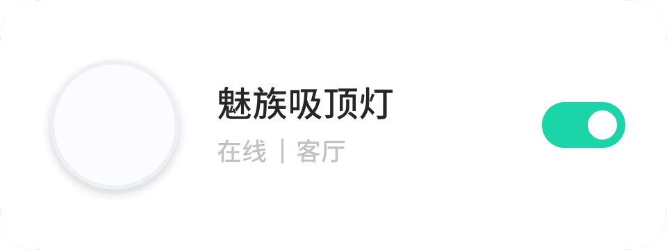
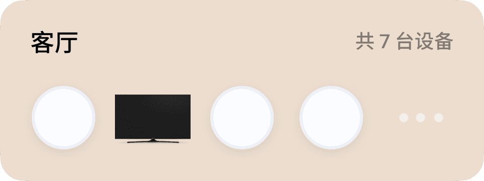
I maintained consistency across the app. For example, room cards and device cards are the same sizes. Empty states are also presented in a card format.


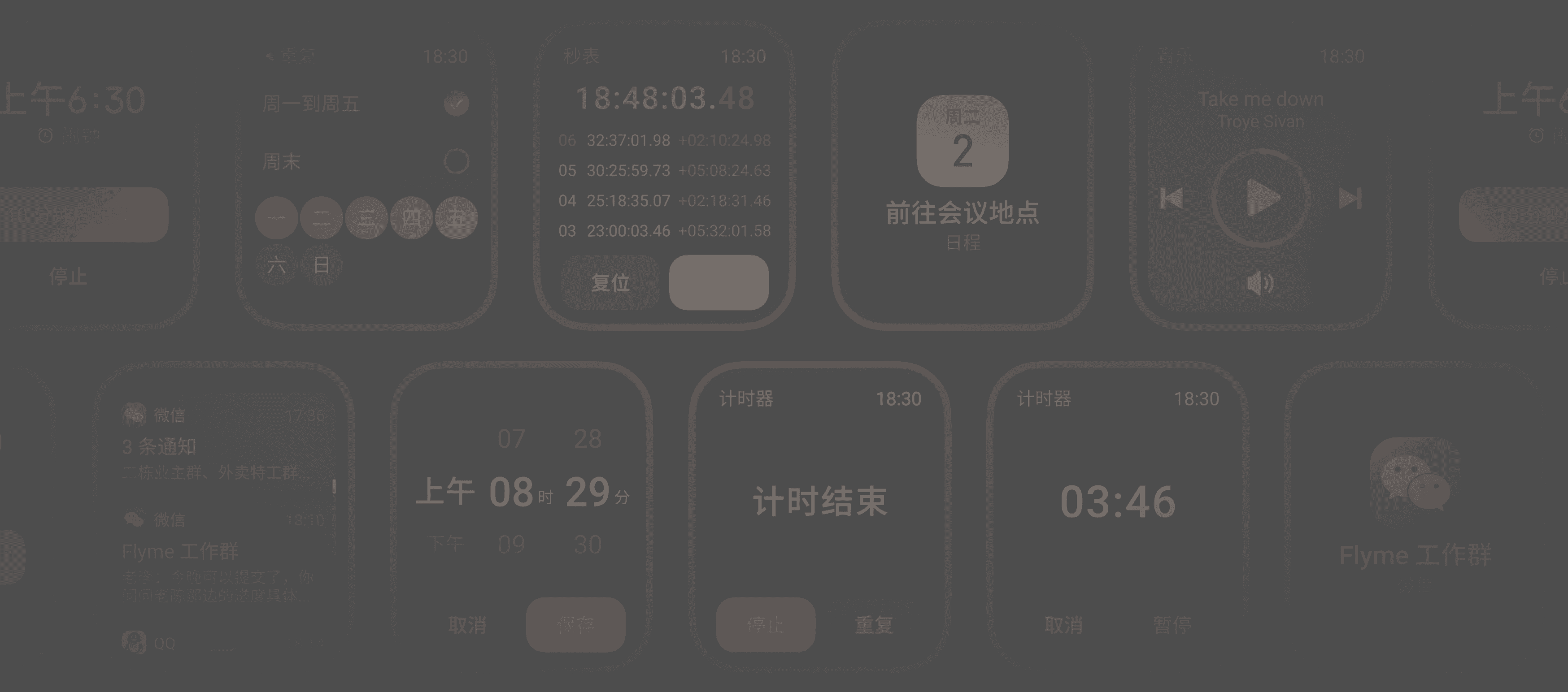
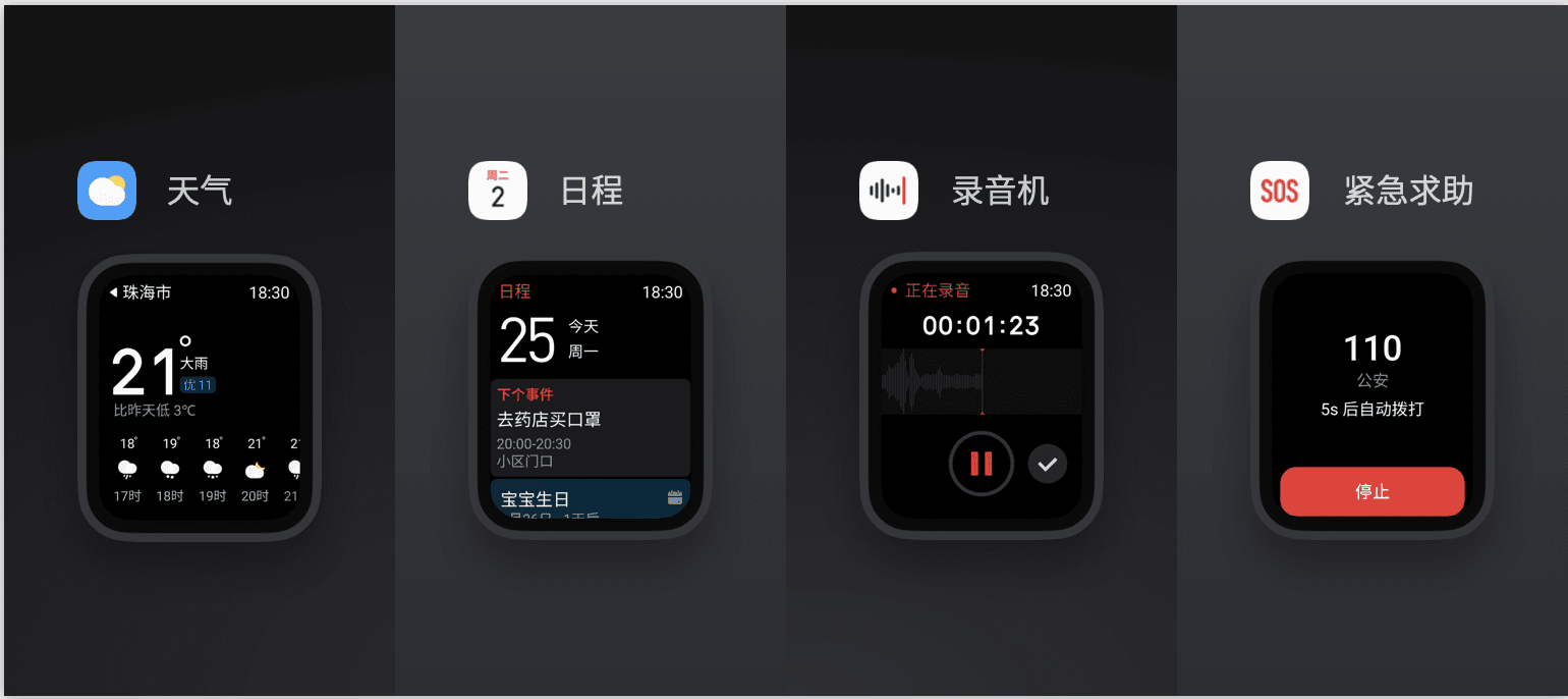
Instead of sharing the existing sounds with phones, our team wanted to customize sounds for our new smartwatch because we think sounds should reflect the different use cases and quality that the watch carries.
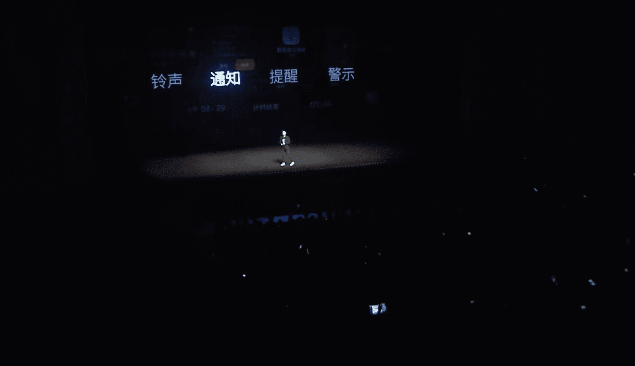
Sounds were highlighted in the launch event and became one of the characteristics that shape a delightful user experience and make MEIZU WATCH stand out from competitors.
TEAM
2 UX Designer, 1 Design Lead, 1 Sound Designer, 1 Project Manager, 1 Developer
TIMELINE
2 months, 2019
I conducted a competitive analysis of popular smartwatches in China, analyzing their sound design strategy. Most brands had sounds dedicated to watches, but only for very few interactions. I identified that sounds could be a differentiator for MEIZU WATCH.
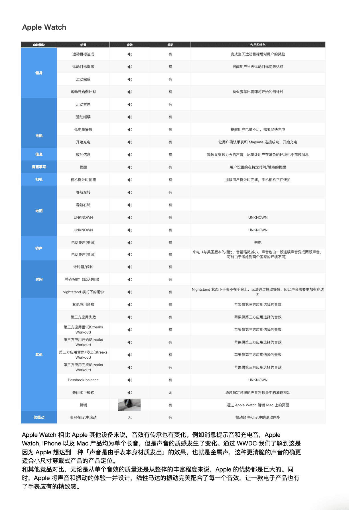
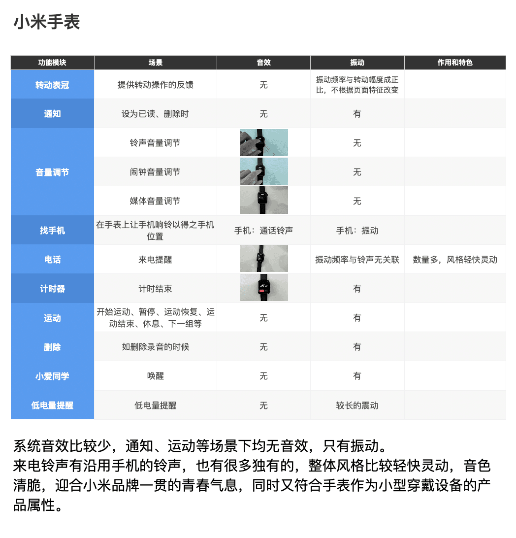
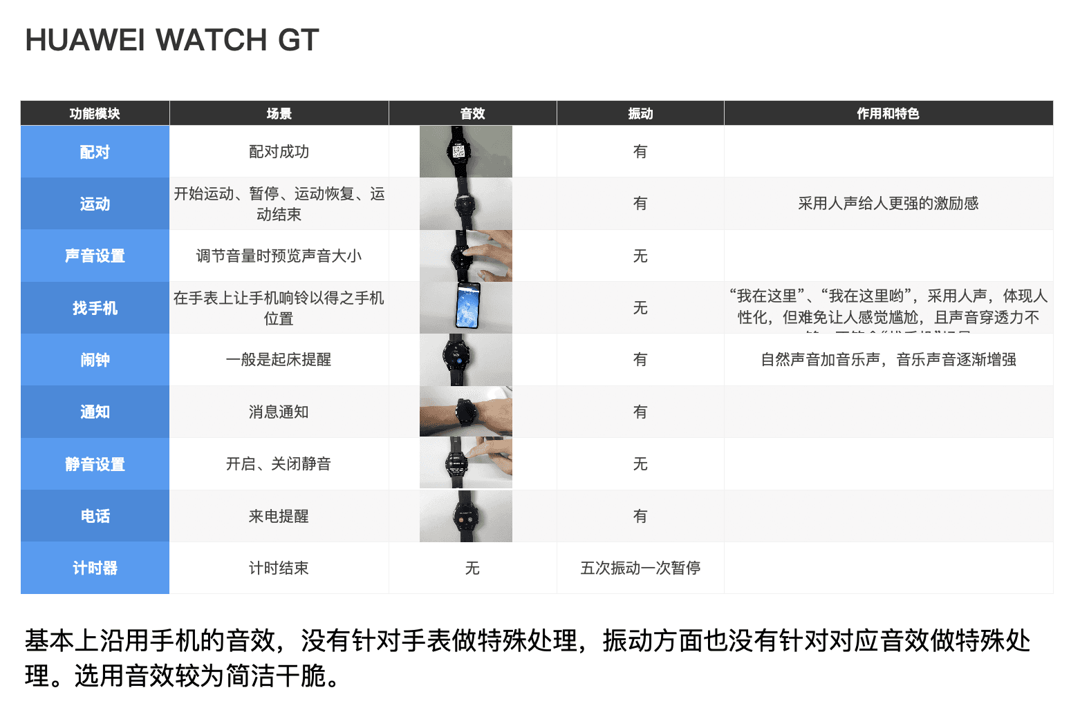
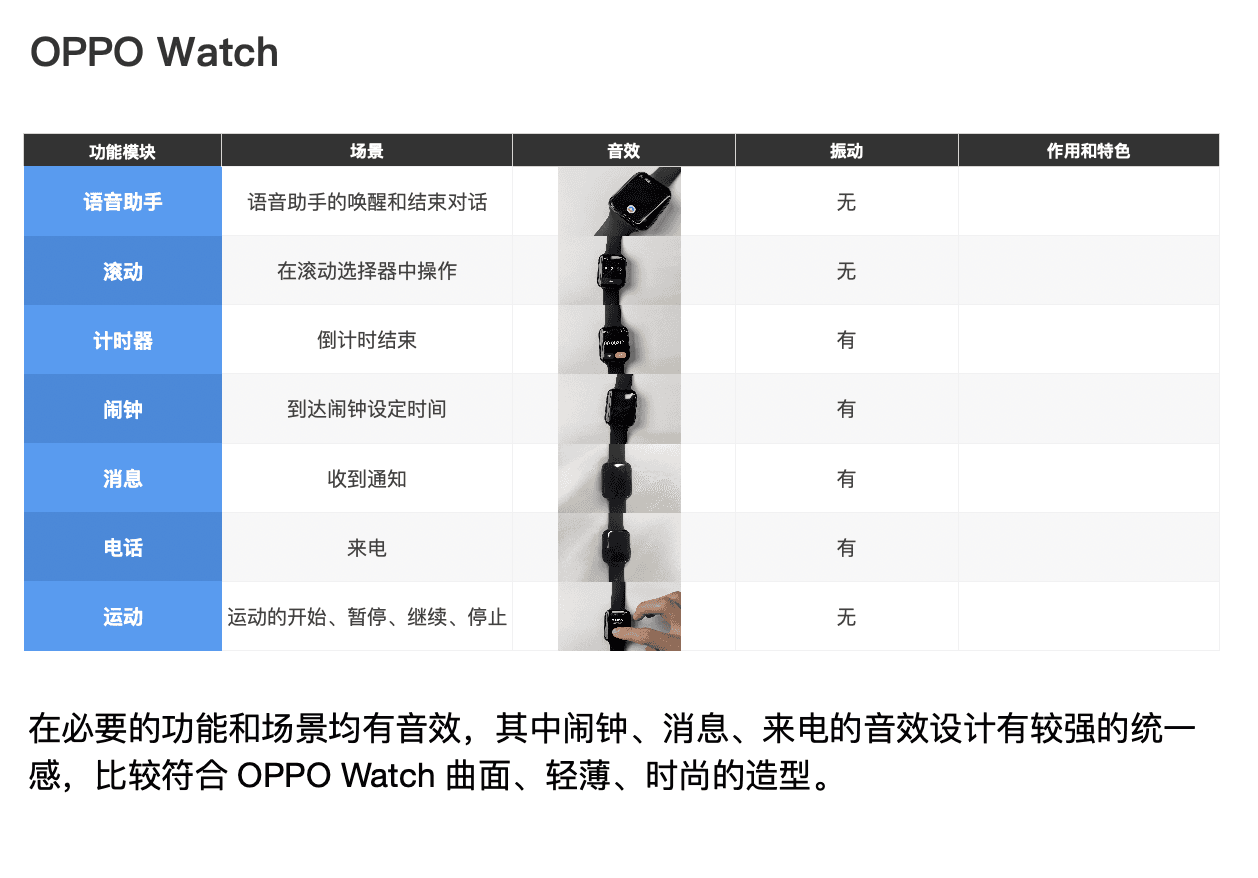
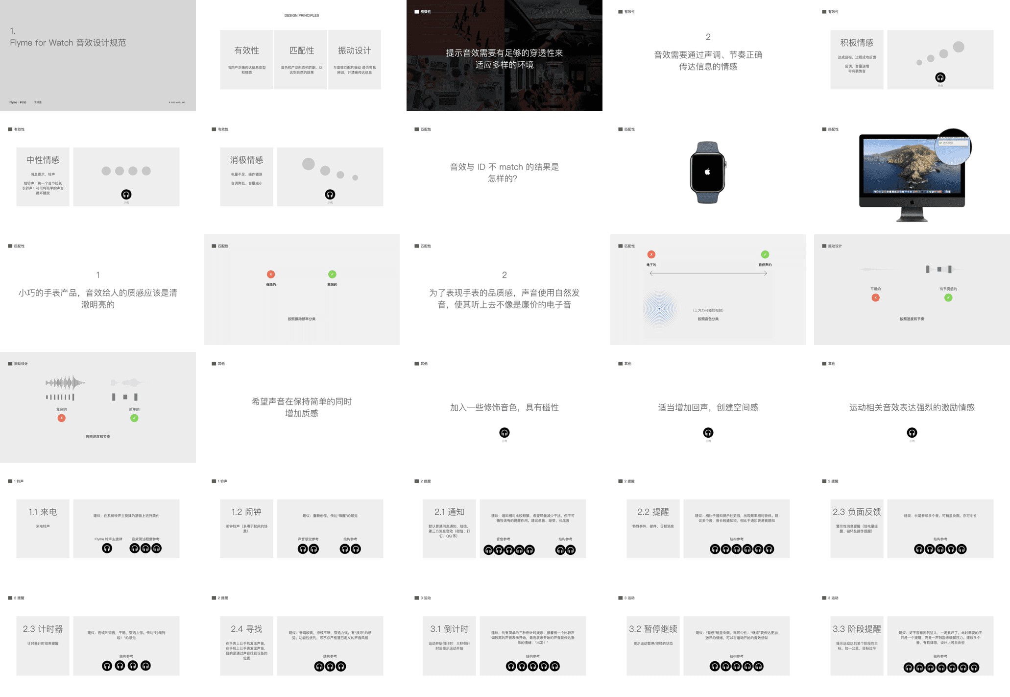
I read and watched online resources to learn the considerations of successful sound designs like Apple Watch and Google Material Design. Combining that with the situation of our own product, I established design guidelines to communicate with the agency responsible for producing the sounds.
Some guidelines are:
Sounds are distinguishable from each other and sounds from other devices, so users get some information without looking at the screen.
Communicate clear emotions. For example, sounds for fitness features should be positive and encouraging.
Add echo effects to mitigate the sound quality of a small speaker.
Flyme is the custom Android OS for MEIZU’s smartphone, with over 100 million users. Our team was working on the next yearly major update, Flyme 9.
Flyme 9 was released in March 2021, featuring safety and smart-assistant improvements. Several features I designed received positive reviews from both the media and users.
TEAM
3 Visual Designers, 3 Product Managers, 2 Android Developers
TIMELINE
7 months, 2019 - 2020
My work at Flyme includes regular feature improvements, including various smart features powered by Aicy intelligence. The following are some features I owned.
Beyond day-to-day designs, I also composed reports to envision, discover and evaluate future opportunities for Flyme.
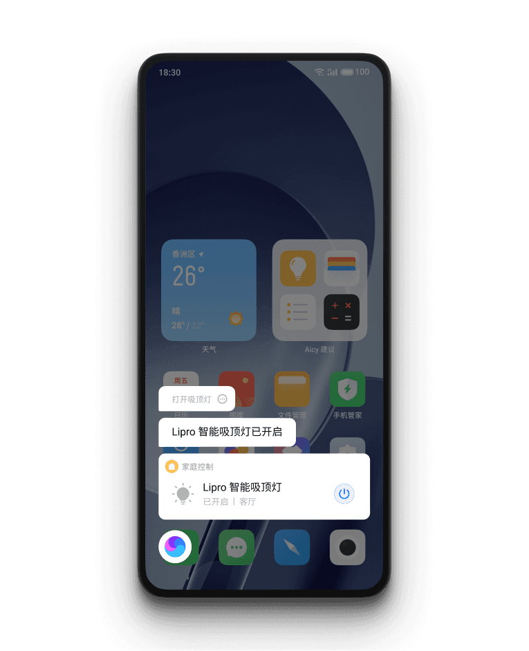
SMART HOME CONTROL
Aicy can control smart home devices from Mi Home, Lipro, and Google Home.
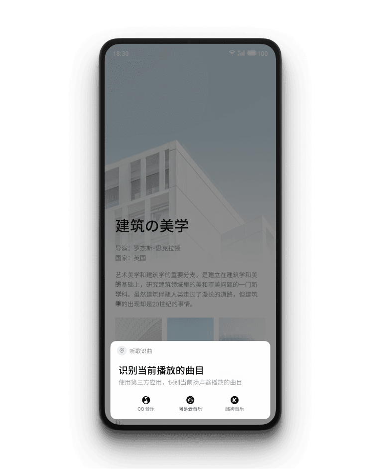
MUSIC RECOGNITION
Designed mainly for TikTok users, Long pressing triggers a small popup to let Aicy recognize the music playing.
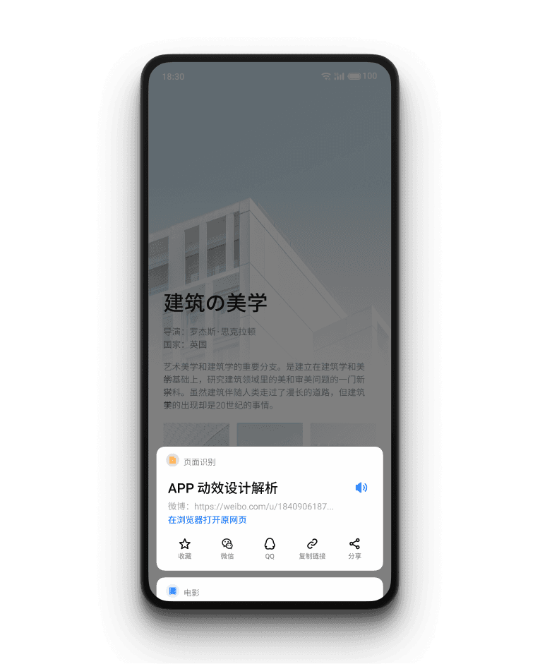
LISTEN TO ARTICLES
Long pressing on an article to let smart assistant read it for you.
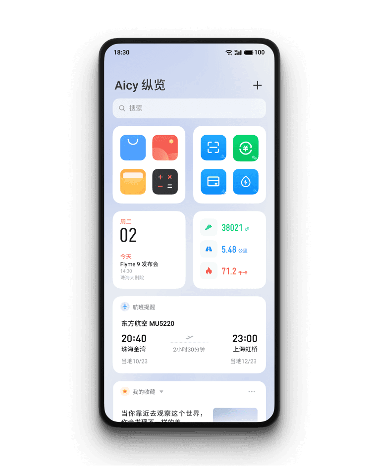
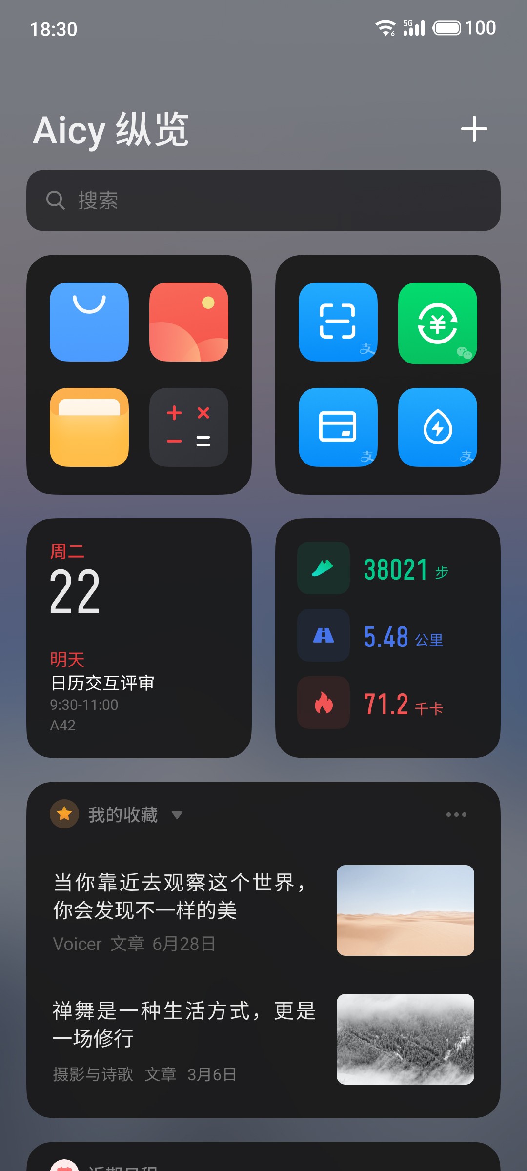
REDESIGNED AICY FEED
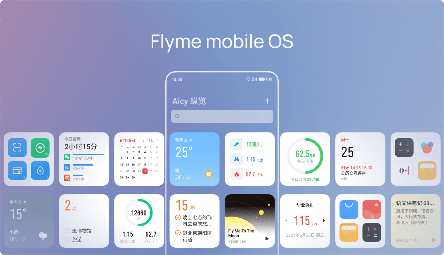
Aicy feed is left to the home screen, where users can add widgets to show information they are interested in.
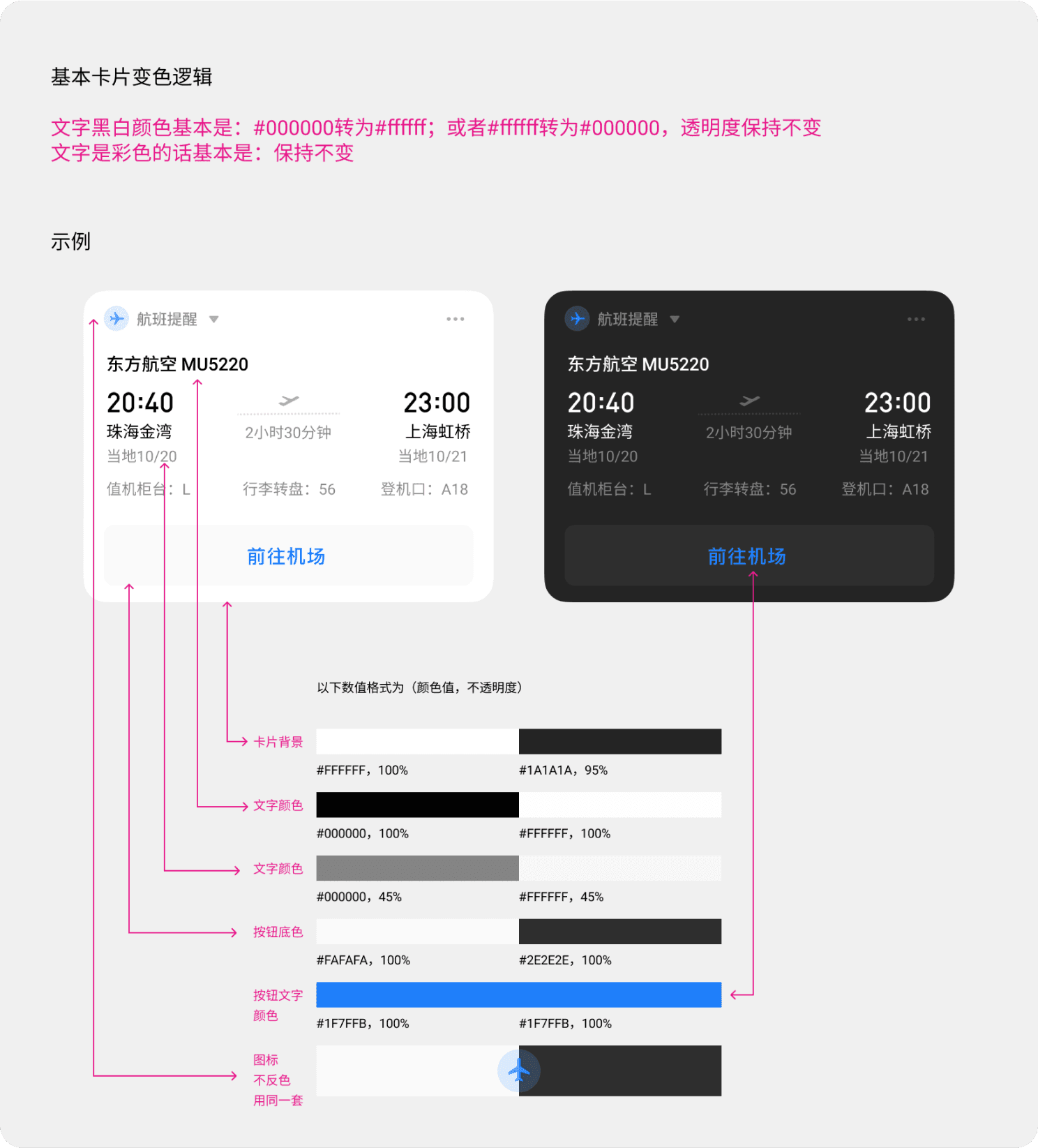
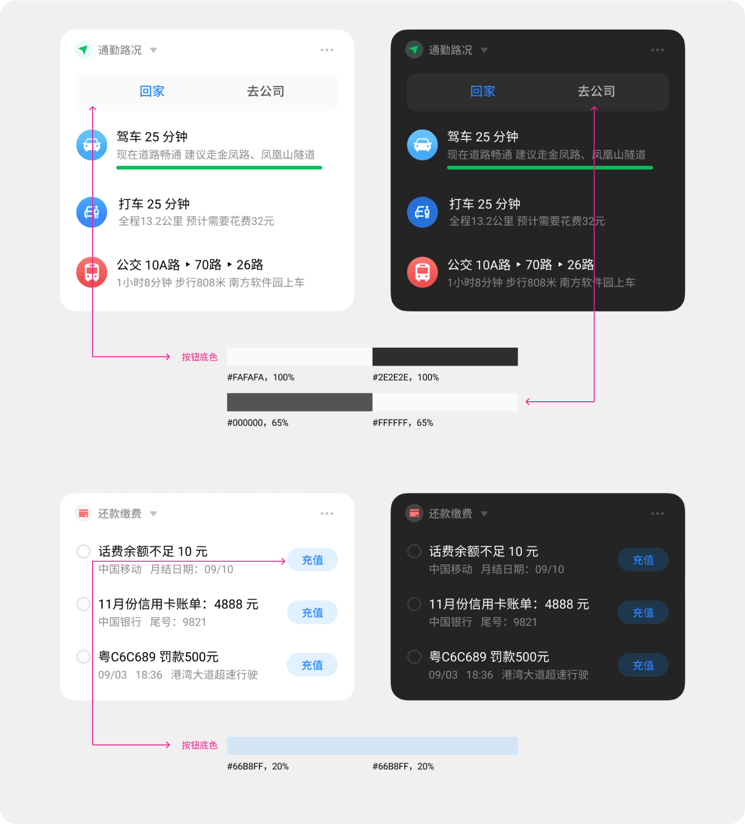
I worked closely with developers to iron out deviations between implementation and design. Below is an instruction I created for developers to understand how to implement dark mode.
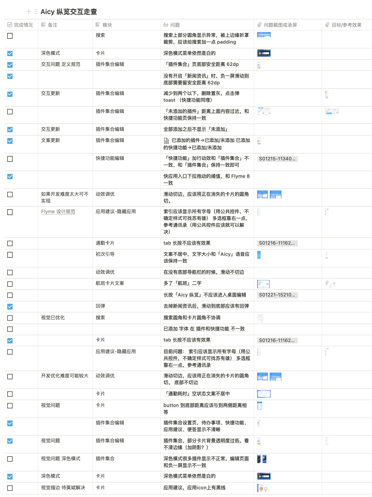
I conducted two rounds of launch review of each feature before launching to solve any usability issues and ensure the user experience was as expected. I used Notion to document and track issues. With attached screenshots and recordings, it makes the demonstration much clearer to developers.
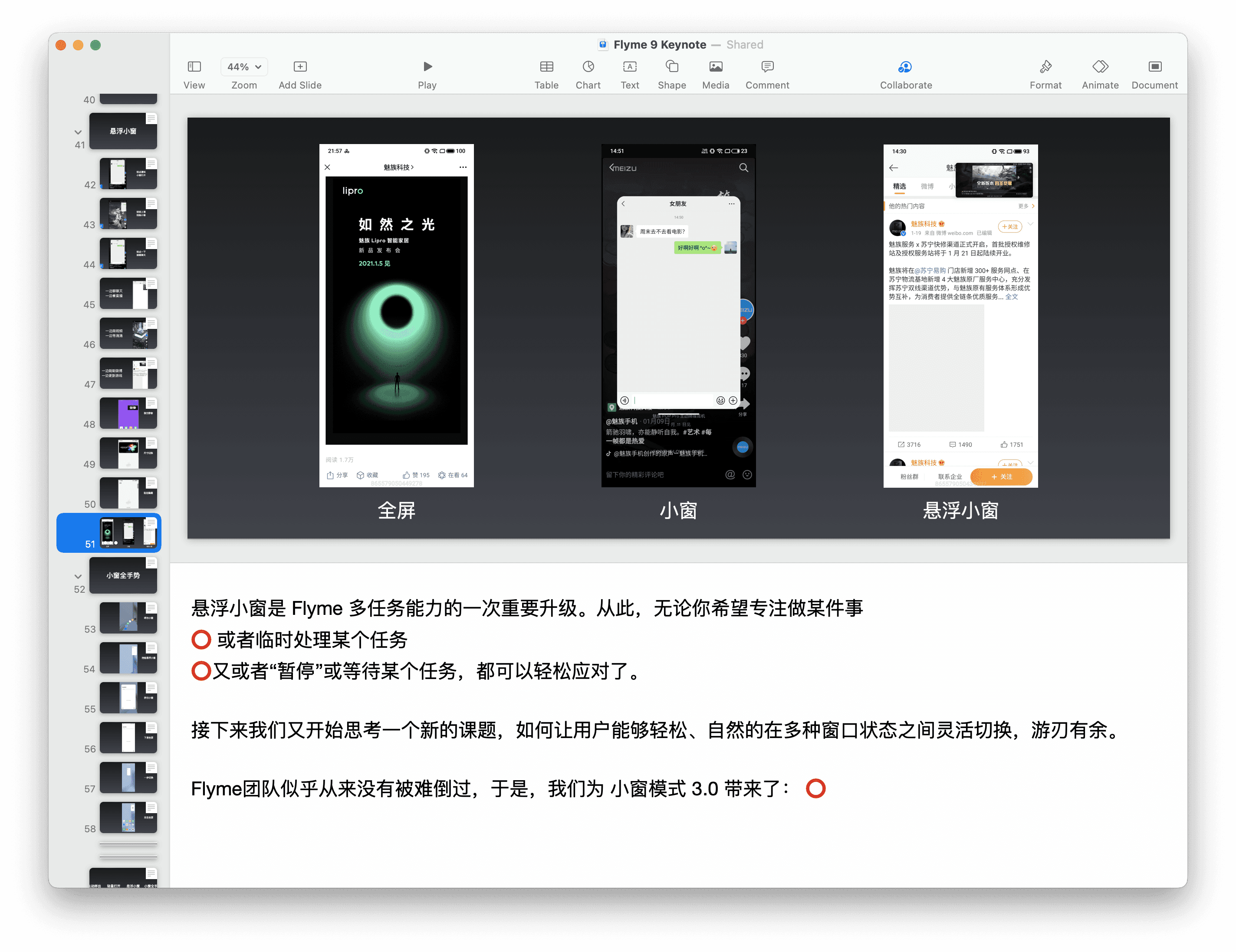
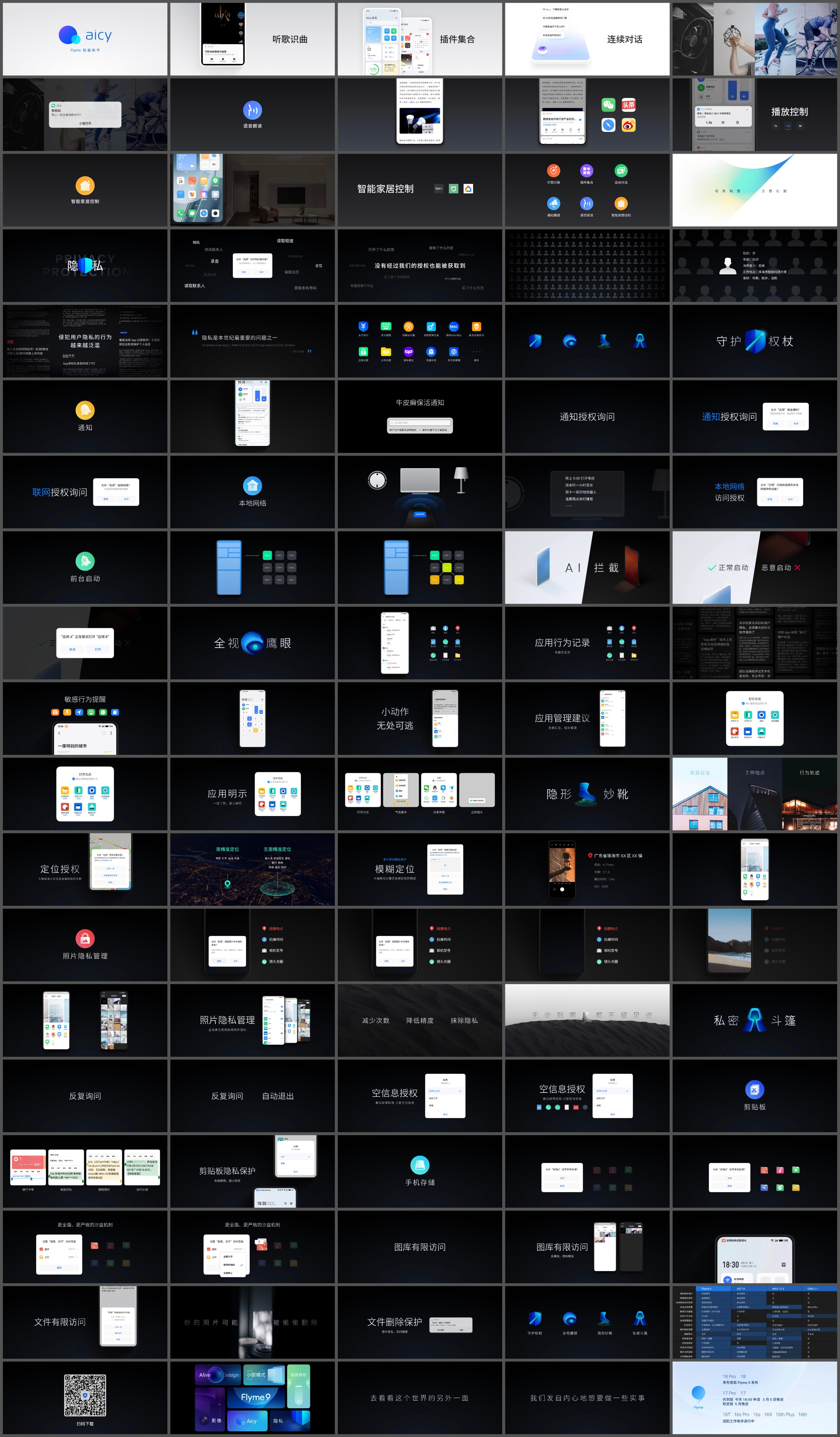
The company will hold an event to launch the updated system and new hardware. Some UX designers are selected to produce the content for the website and presentation slides.
I was selected to help prepare the presentation for our yearly launch event.
The event was streamed online to millions of users.
TEAM
10 Designers, 4 Product Managers
TIMELINE
3 weeks, 2020
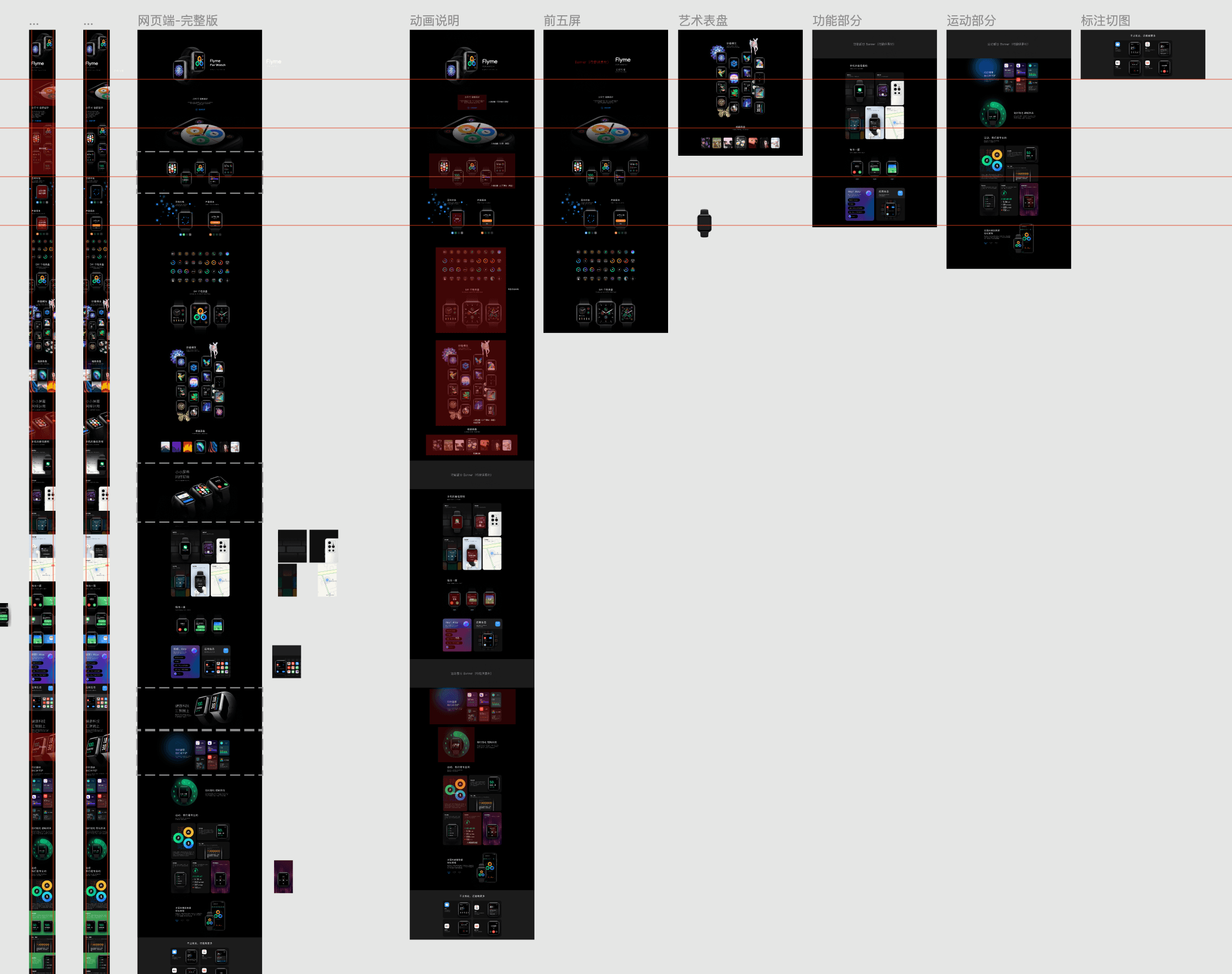
I also designed part of the websites of Flyme and Flyme for WATCH.
