
The next generation in-car OS for a new sedan, P7, that is intelligent, inclusive, and safe.
Prototyping
Usability Testing
Launch Review
Motion Design
Documentation Guidelines
Shuai Deng - Senior HMI Designer
Yingjie Deng - Visual Designer
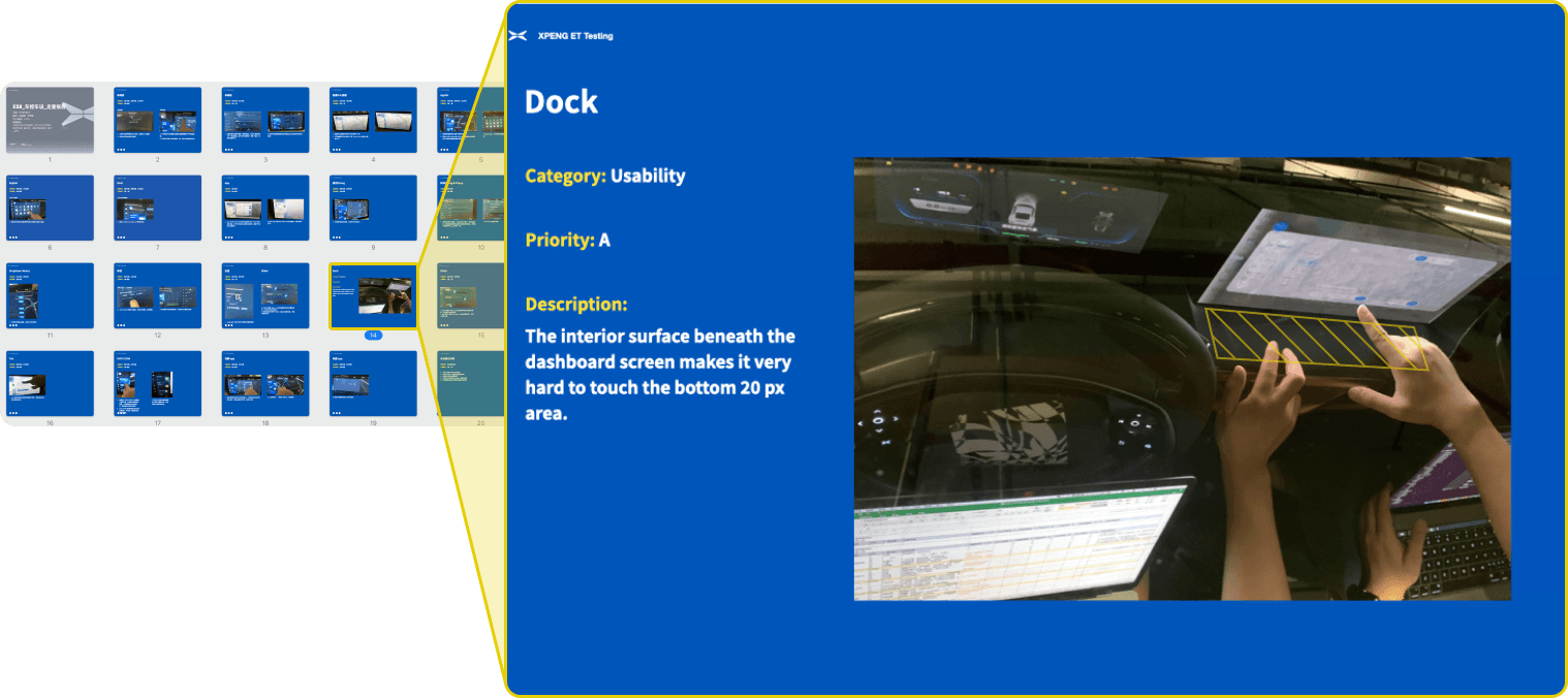
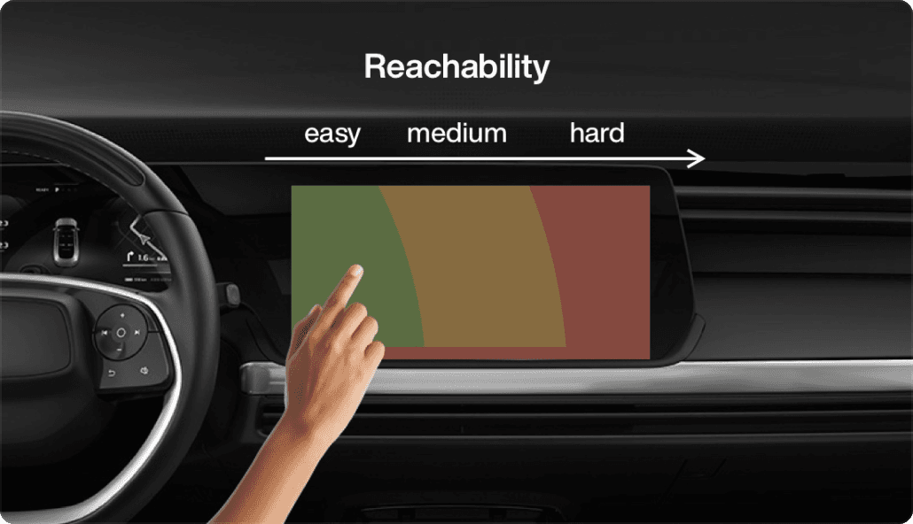
Hardware ergonomics limitation
May - Aug 2019
Launched in Jul 2020
On-screen interfaces, usability testing, and design documentation guidelines
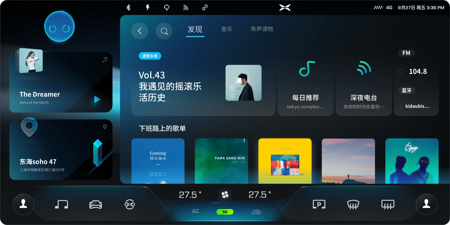
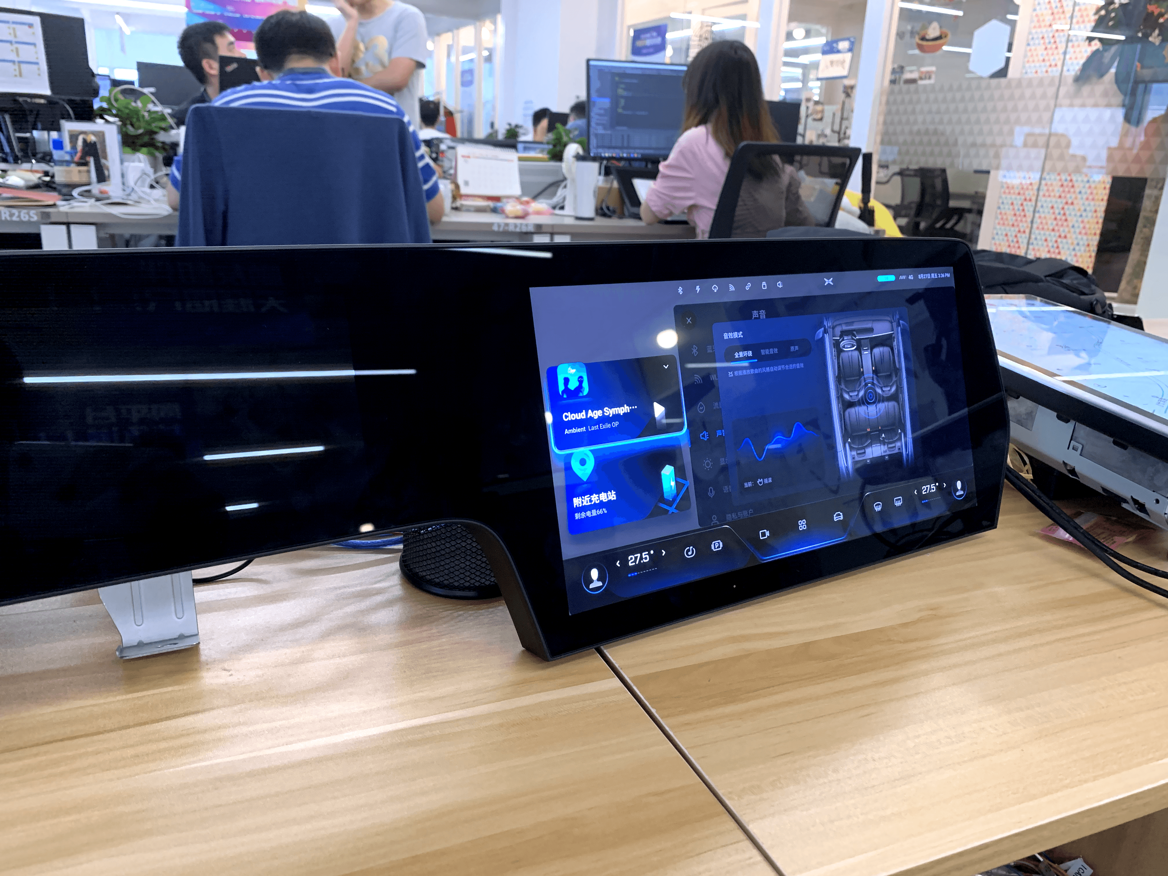
At Xpeng, my work is in three parts. One is HMI (Human-Machine Interface) design of System UI of the new Xmart OS, under close collaboration with PMs, visual designers, and engineers. I designed the dock bar, status bar, and proposed an innovative smart suggestion feature. Designs were shipped in Jul 2020.
As an intern, I also assisted other designers to conduct launch reviews, where I spotted and logged issues, and communicated with engineers and designers to find solutions.
Additionally, I also created a documentation guideline, which was used by the design team ever since. The guideline helped designers to standardize the format to make various UI statuses easier to understand.
business goal
Xpeng at that time was an EV (electric vehicle) startup with only one launched entry-level product. The company decided to develop a premium product with top-notch intelligent ability. Therefore, Xpeng can create a key differentiator in the EV industry, potentially leading to better sales and better brand awareness.
Enabled by modern technologies, mobility experience becomes more human-centered.
I conducted secondary research to understand the historical development of HMI (Human-Machine Interface). While traditionally mechanical performance is the focus of car design, I identified that human experience becomes the new focus of the design for mobility. This is enabled by the progression of technologies like the ability to sense the environment and understand the people. I identified design goals as follows and brought them into designing System UI.
Traditionally car controls are designed in a driver-centric way. The dashboard looks confusing and almost intimidating to the passenger.
Leverage connectivity to provide context-aware experience
Traditional car functions are based on merely hardware. Modern EVs have the connectivity to internet, and more available data from sensors, which can be leveraged to provide context-aware experience beyond hardware.
Balance functionality with safety
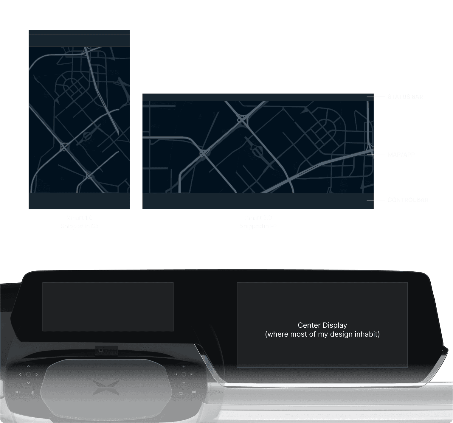
Legacy design in a new display ratio as the starting point
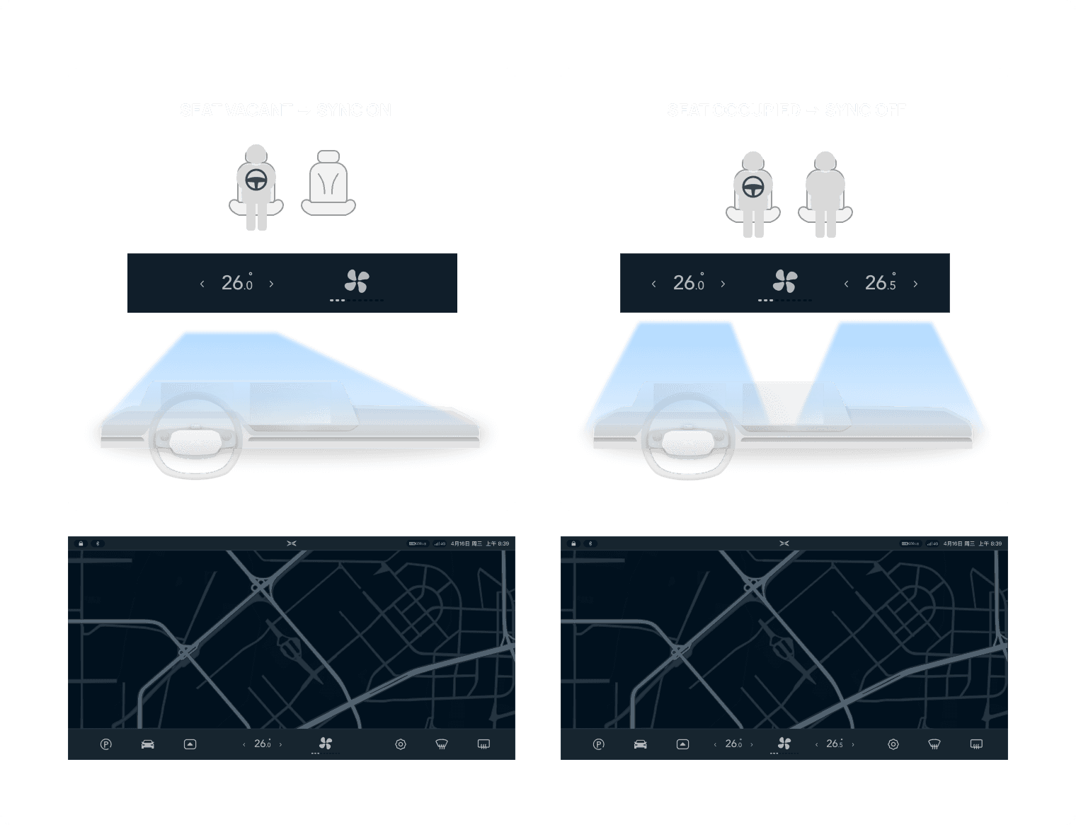
initially I moved the temperature control from the center to the sides
However, I realized I went with a wrong direction because the true pain point is passenger not having the agency to control AC. This is because drivers often turn SYNC mode on, which means the temperature on the passenger side will be controlled together by the driver. This gives an unwelcoming feeling to the passenger.
I reapproached the problem and designed an adaptive AC control by leveraging the seat occupancy sensor so that the car is contextually aware. Driver owns the control when there is no passenger. But the system will provide passenger the agency to control AC the moment they step into the car.
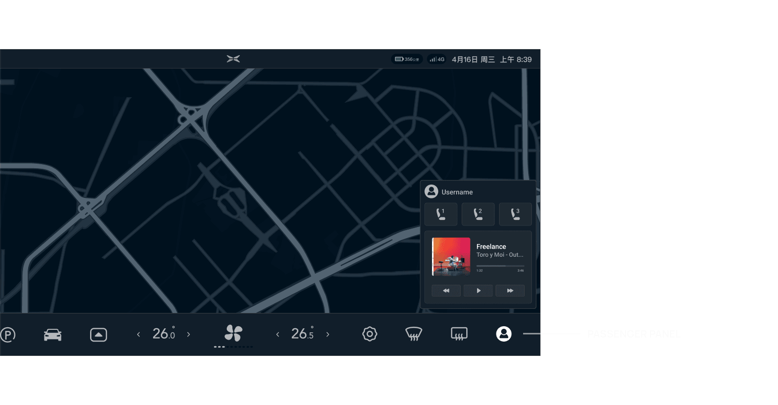
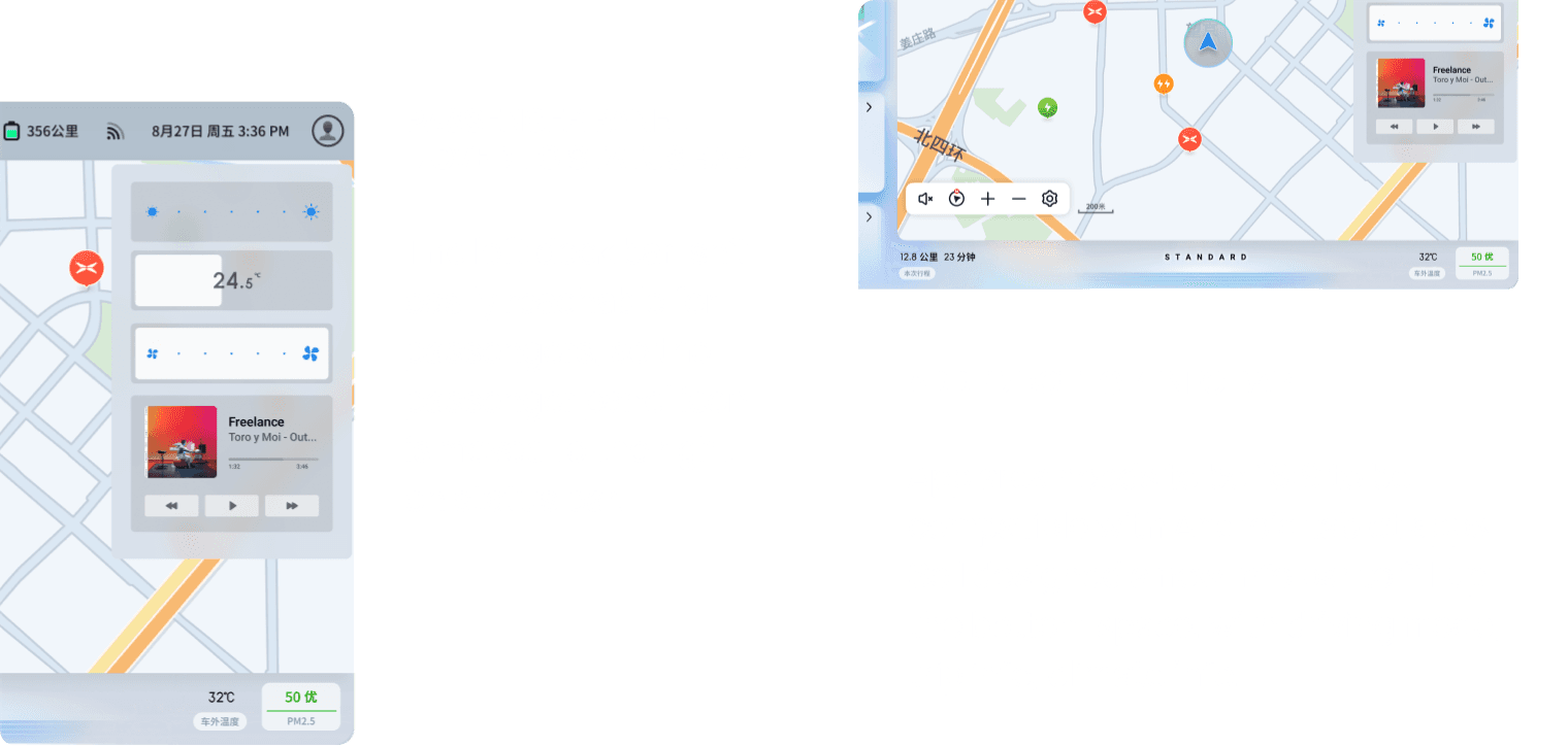
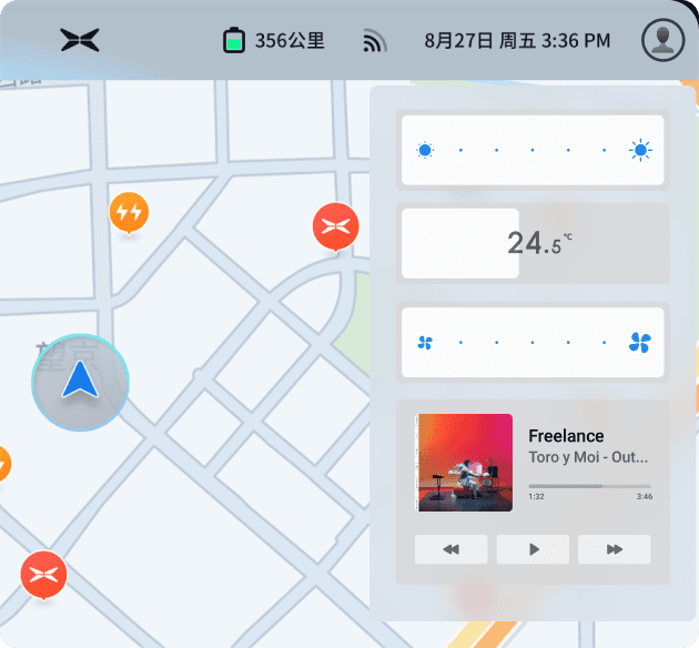
Passengers didn’t have easy-to-access controls like drivers with steering wheel buttons. I came up with the passenger panel that brings music control at their fingertips. They can also save their preferred seat positions to their accounts.
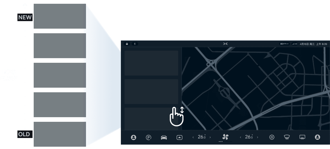
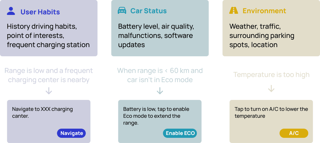
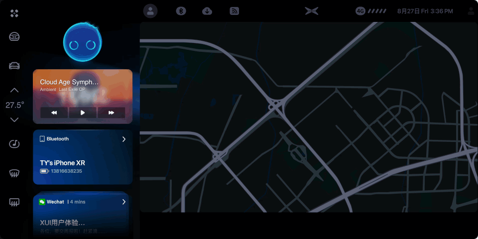
Smart Suggestions to increase interaction efficiency
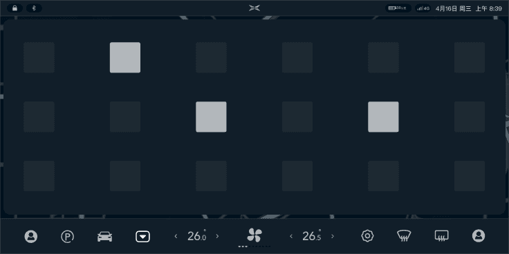
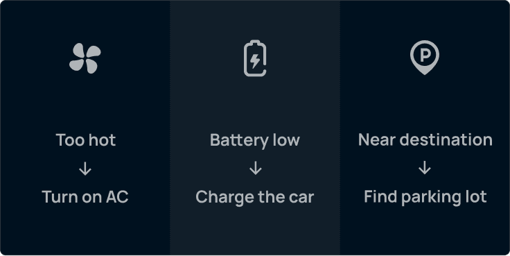
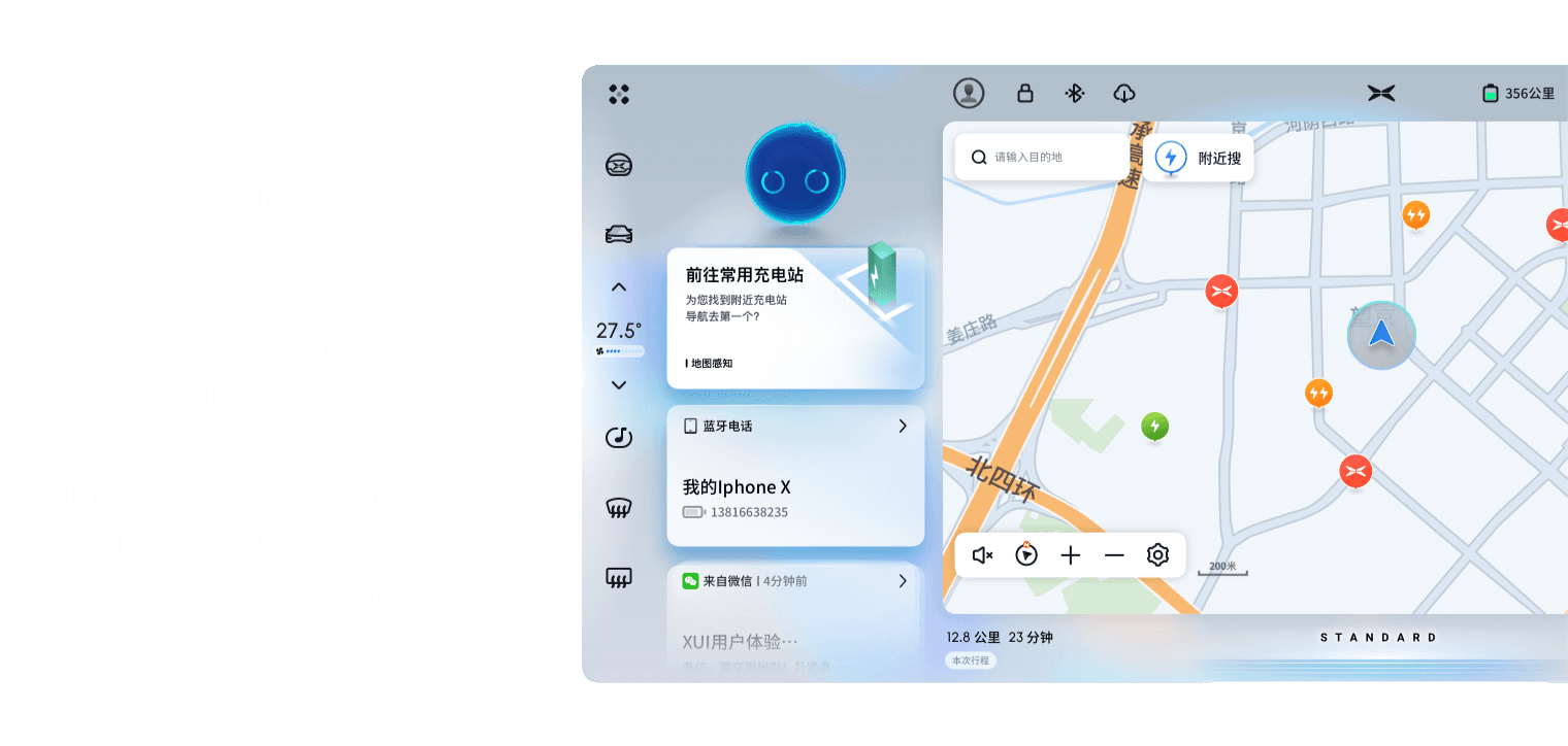
I proposed INFO FLOW to provide contextual suggestions by surfacing apps and services when drivers need them. INFO FLOW is a card feed consisting recommended app or service. This leads to more efficient interaction, and therefore safer driving because drivers can keep their eyes on the road.
Because different parts of the system are involved in this feature, our design team ideated together based on my concept. Then I established the triggering conditions of smart recommendations. Because of confidentiality, some descriptions are placeholders.


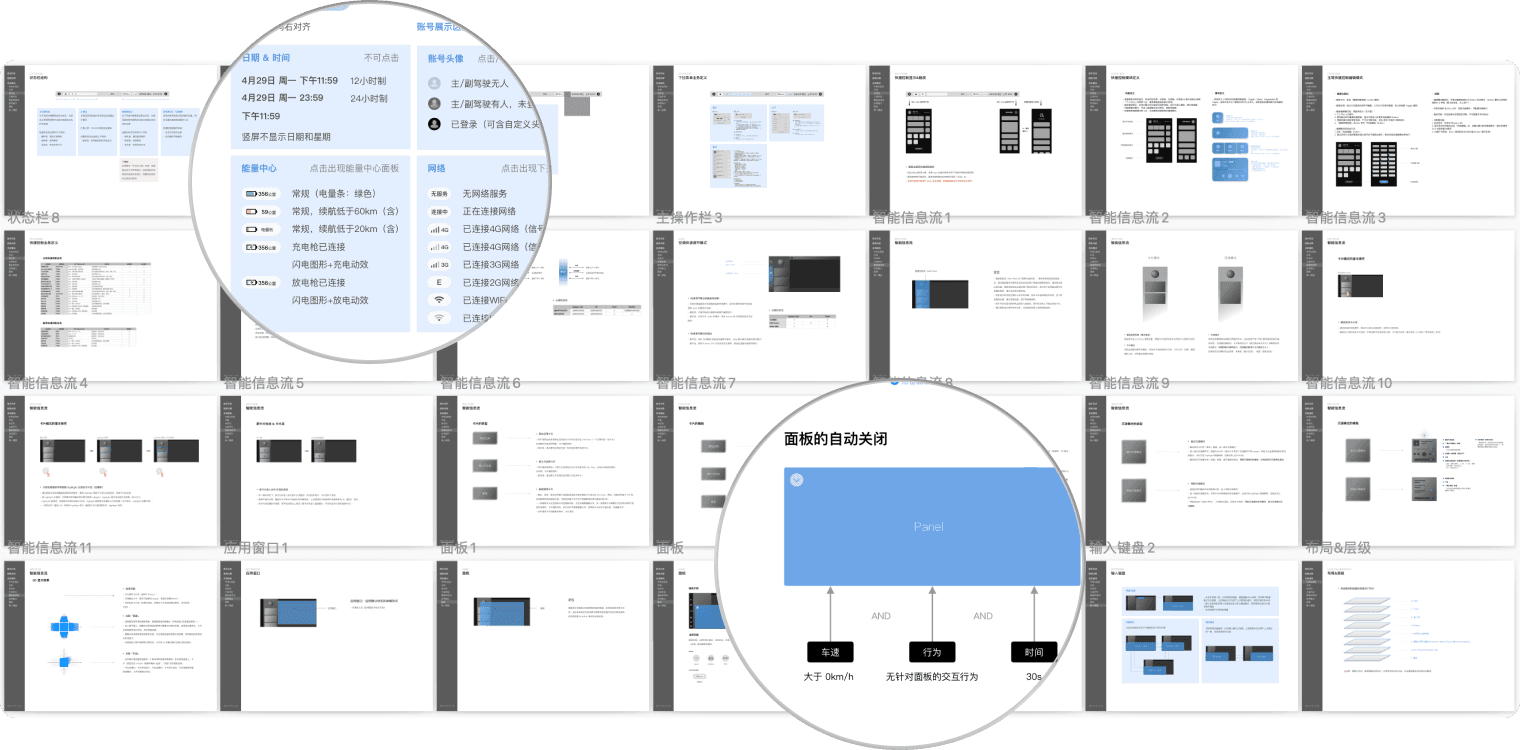
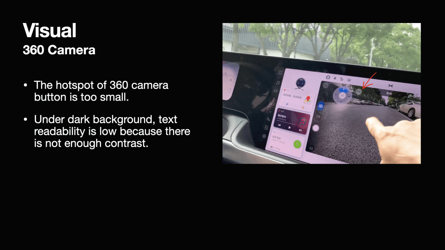
Given the confidentiality of some not-shipped designs, not all of my work was included. Below is a screenshot of a design document I created, which now becomes the template of the team. The document was used to communicate between interaction designers, visual designers, and engineers. Many features have multiple status, and the interaction can be affected by multiple factors including user intervention, car status, or auto dismiss. Therefore descriptive text and illustrations are important.
Collaborating with visual designer and developer to create hi-fidelity prototypes
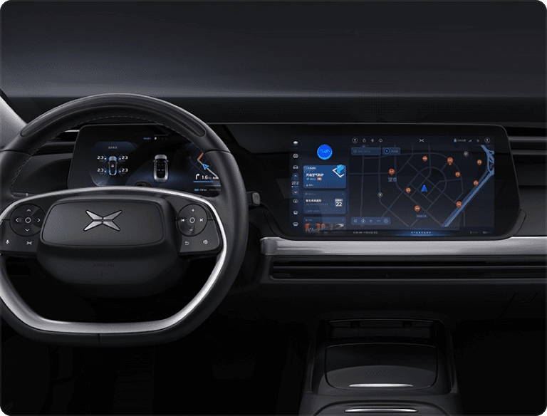
I worked with a visual designer to deliver a modern and futuristic look.
Intelligent, inclusive & safe
Experience caters to passengers
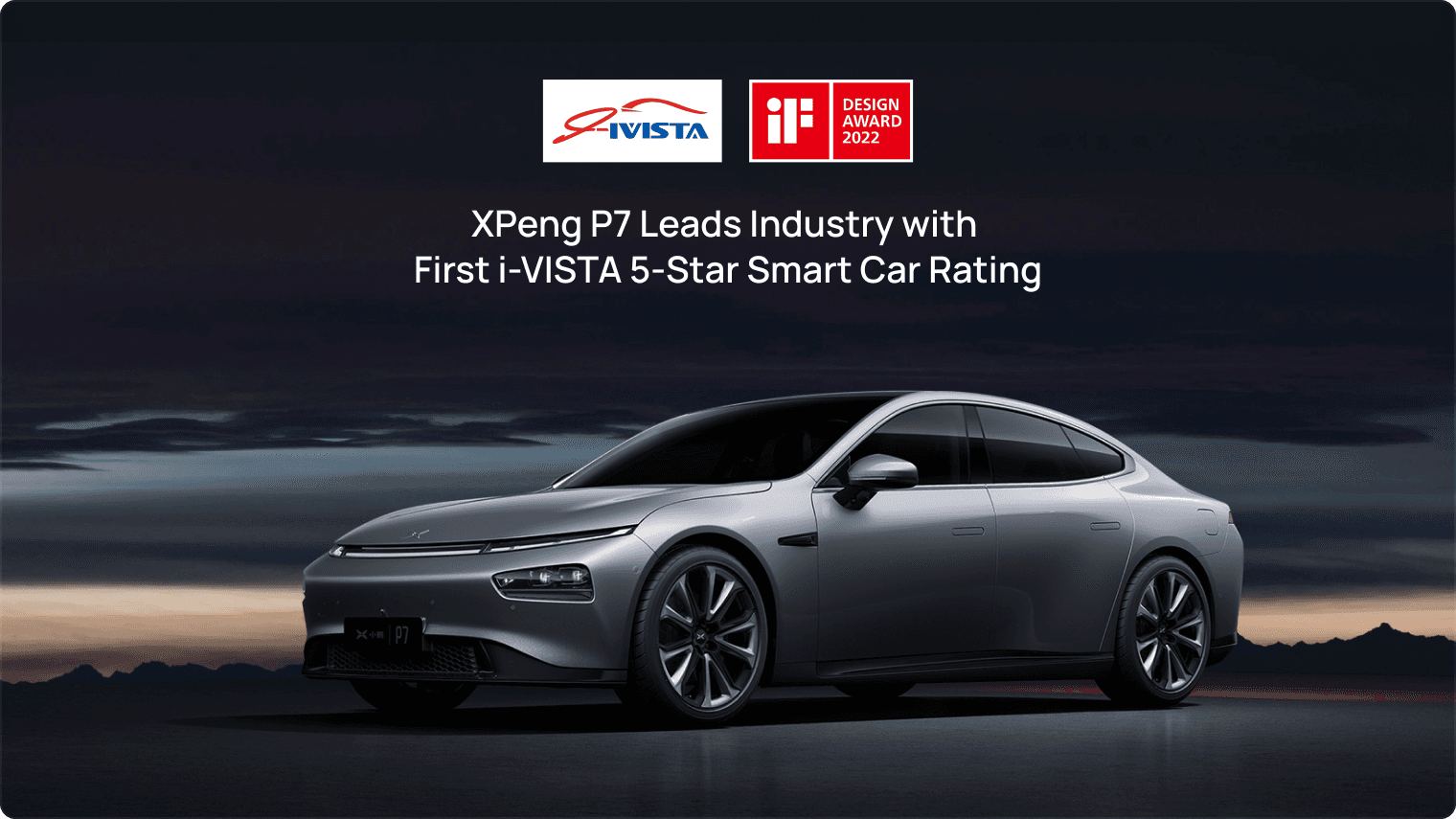
After launch, the car was positively reviewed by Chinese medias especially because of its smart features. It got the highest smart car rating from IVISTA. The new Xmart OS won the iF design awards 2022. P7 was the best-selling EV in Chinese market for 3 consecutive quarters in 2021.
On the personally level, the major takeaway is to learn to design in the context. Designing for automobile is not only considering about the screen, but also about the context the users are in. If they are driving, is it safe for them to use this feature? My cross-screen info flow design didn’t make the final cut because after discussion with PM, I realized that the complexity was so high that it could confuse users.
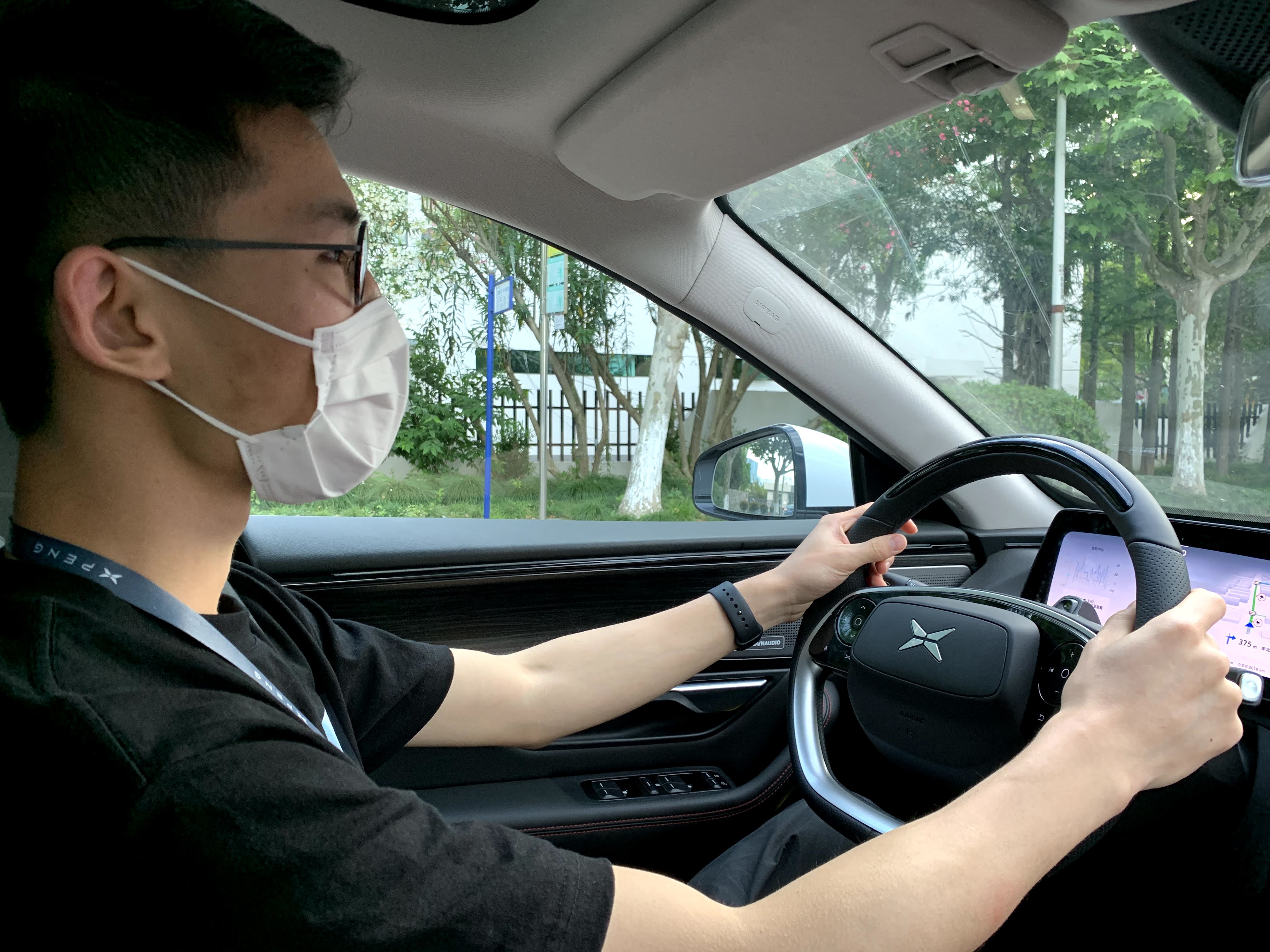
On the organization level, I realized software R&D should be synchronized with hardware team because system features could be infeasible because of hardware limitation. Knowing hardware limitation early on and testing regularly in its physical form are very critical.
The next generation in-car OS for a new sedan, P7, that is intelligent, inclusive, and safe.
Prototyping
Usability Testing
Launch Review
Motion Design
Documentation Guidelines
Shuai Deng - Senior HMI Designer
Yingjie Deng - Visual Designer
Hardware ergonomics limitation
May - Aug 2019
Launched in Jul 2020
On-screen interfaces, usability testing, and design documentation guidelines
At Xpeng, my work is in three parts. One is HMI (Human-Machine Interface) design of System UI of the new Xmart OS, under close collaboration with PMs, visual designers, and engineers. I designed the dock bar, status bar, and proposed an innovative smart suggestion feature. Designs were shipped in Jul 2020.
As an intern, I also assisted other designers to conduct launch reviews, where I spotted and logged issues, and communicated with engineers and designers to find solutions.
Additionally, I also created a documentation guideline, which was used by the design team ever since. The guideline helped designers to standardize the format to make various UI statuses easier to understand.
business goal
Xpeng at that time was an EV (electric vehicle) startup with only one launched entry-level product. The company decided to develop a premium product with top-notch intelligent ability. Therefore, Xpeng can create a key differentiator in the EV industry, potentially leading to better sales and better brand awareness.
Enabled by modern technologies, mobility experience becomes more human-centered.
I conducted secondary research to understand the historical development of HMI (Human-Machine Interface). While traditionally mechanical performance is the focus of car design, I identified that human experience becomes the new focus of the design for mobility. This is enabled by the progression of technologies like the ability to sense the environment and understand the people. I identified design goals as follows and brought them into designing System UI.
Traditionally car controls are designed in a driver-centric way. The dashboard looks confusing and almost intimidating to the passenger.
Leverage connectivity to provide context-aware experience
Traditional car functions are based on merely hardware. Modern EVs have the connectivity to internet, and more available data from sensors, which can be leveraged to provide context-aware experience beyond hardware.
Balance functionality with safety
Legacy design in a new display ratio as the starting point
initially I moved the temperature control from the center to the sides
However, I realized I went with a wrong direction because the true pain point is passenger not having the agency to control AC. This is because drivers often turn SYNC mode on, which means the temperature on the passenger side will be controlled together by the driver. This gives an unwelcoming feeling to the passenger.
I reapproached the problem and designed an adaptive AC control by leveraging the seat occupancy sensor so that the car is contextually aware. Driver owns the control when there is no passenger. But the system will provide passenger the agency to control AC the moment they step into the car.
Passengers didn’t have easy-to-access controls like drivers with steering wheel buttons. I came up with the passenger panel that brings music control at their fingertips. They can also save their preferred seat positions to their accounts.
Smart Suggestions to increase interaction efficiency
I proposed INFO FLOW to provide contextual suggestions by surfacing apps and services when drivers need them. INFO FLOW is a card feed consisting recommended app or service. This leads to more efficient interaction, and therefore safer driving because drivers can keep their eyes on the road.
Because different parts of the system are involved in this feature, our design team ideated together based on my concept. Then I established the triggering conditions of smart recommendations. Because of confidentiality, some descriptions are placeholders.
Given the confidentiality of some not-shipped designs, not all of my work was included. Below is a screenshot of a design document I created, which now becomes the template of the team. The document was used to communicate between interaction designers, visual designers, and engineers. Many features have multiple status, and the interaction can be affected by multiple factors including user intervention, car status, or auto dismiss. Therefore descriptive text and illustrations are important.
Collaborating with visual designer and developer to create hi-fidelity prototypes
I worked with a visual designer to deliver a modern and futuristic look.
Intelligent, inclusive & safe
Experience caters to passengers
After launch, the car was positively reviewed by Chinese medias especially because of its smart features. It got the highest smart car rating from IVISTA. The new Xmart OS won the iF design awards 2022. P7 was the best-selling EV in Chinese market for 3 consecutive quarters in 2021.
On the personally level, the major takeaway is to learn to design in the context. Designing for automobile is not only considering about the screen, but also about the context the users are in. If they are driving, is it safe for them to use this feature? My cross-screen info flow design didn’t make the final cut because after discussion with PM, I realized that the complexity was so high that it could confuse users.
On the organization level, I realized software R&D should be synchronized with hardware team because system features could be infeasible because of hardware limitation. Knowing hardware limitation early on and testing regularly in its physical form are very critical.